Campaign Step
The following are the main sections you can configure for each campaign step. You can access these options in the right panel under the Design tab.
The best thing is that Fluentos gives you a live preview of your changes. For example, if you define the button color, you will be able to see it on the screen even before you save or publish your settings.
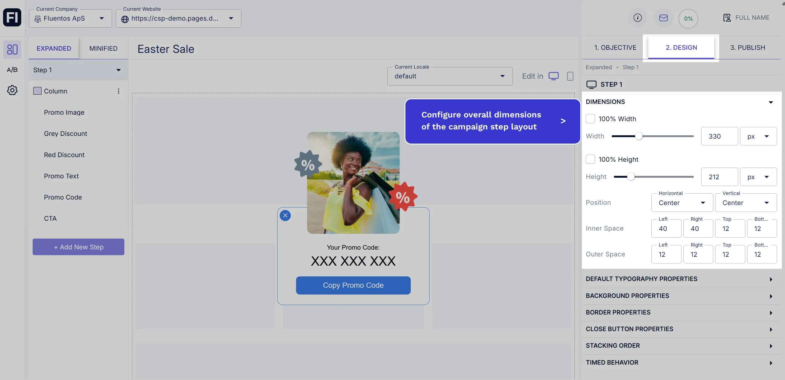
Dimensions
Section titled “Dimensions”You can configure the following dimensional properties of the campaign layout:
-
Width & Height: Adjust the step width and height using their sliders or the numeric steppers. You can also input the exact figure in the numeric stepper input field. If you want the step to have the maximum width so it spreads across the page, checkmark the checkbox 100% Width. And, if you wish to the maximum height of the step, checkmark the 100% Height option.
-
Position: You can also configure the step’s horizontal and vertical position on the website page. The available options for horizontal alignment are Center, Left, and Right, and the available vertical alignment options are Top, Center, and Bottom.
-
Inner Space: Here, you can configure the step padding for the background. You can configure it for all four sides: Left, Right, Top, and Bottom. If you don’t want any space, just set all four properties to zero (0).
-
Outer Space: Use this option to configure the step margins for all four sides: Left, Right, Top, and Bottom.
Default Typography Properties
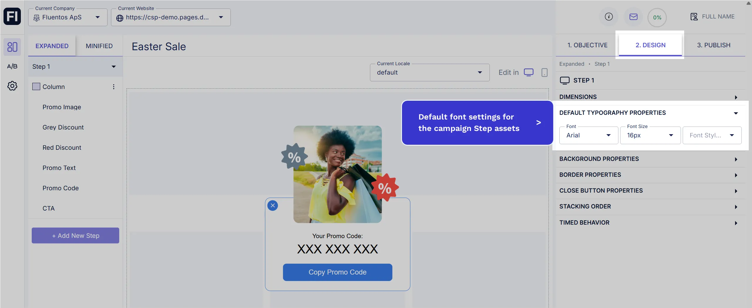
Section titled “Default Typography Properties”Under this section, you can set up the default font settings for the selected step of your campaign. So, whenever you add a new asset to that particular campaign step, the configured font settings will automatically be applied to the text of the new asset. For example, if you add a new button, the default font style properties will be applied to the button label text. The font properties you can configure are:
- Font family
- Font size
- Font formatting style (bold/italic)
Background Properties
Section titled “Background Properties”You can set the campaign background color and the image simultaneously.
-
Background Image
Use the Asset Manager option to upload an image that you want to set as the step background. Once it’s uploaded, you can customize its display with the following settings:-
Image Fit: You can either select “Fit and keep aspect ratio” to add the image in its original ratio or “Zoom in to fill the space” to fill the background with the image.
-
Repeat: Select No Repeat if you don’t want the image repetition in the background. However, if you want to repeat the image in the background, you have these three options: Repeat Horizontally and Vertically, Repeat Horizontally, Repeat Vertically.
-
Position: Here, you can adjust the image’s horizontal and vertical alignment with respect to the background.
-
-
Background Color
Regardless of the background image, you can always set a background color. To do so, use the color picker by clicking on the color box or enter the hex code in the input field next to it.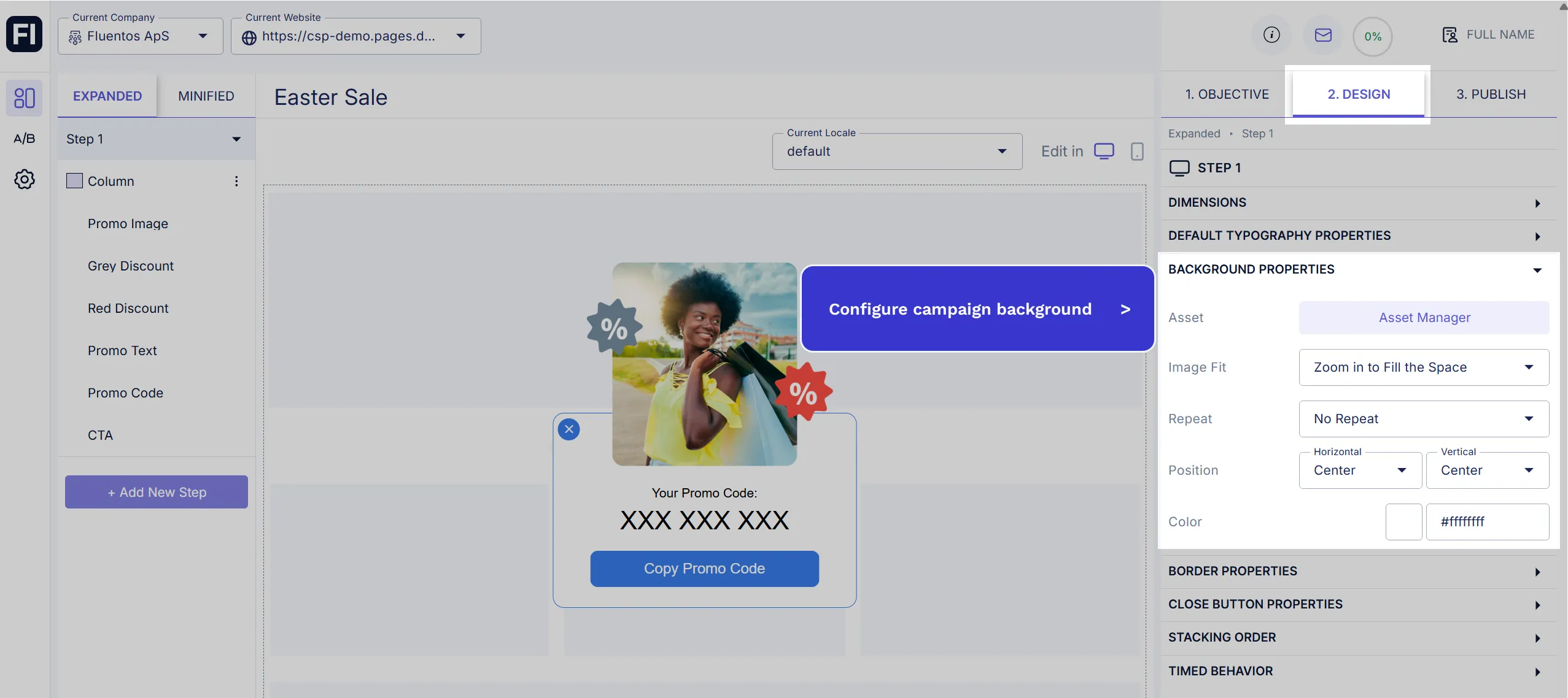
Border Properties
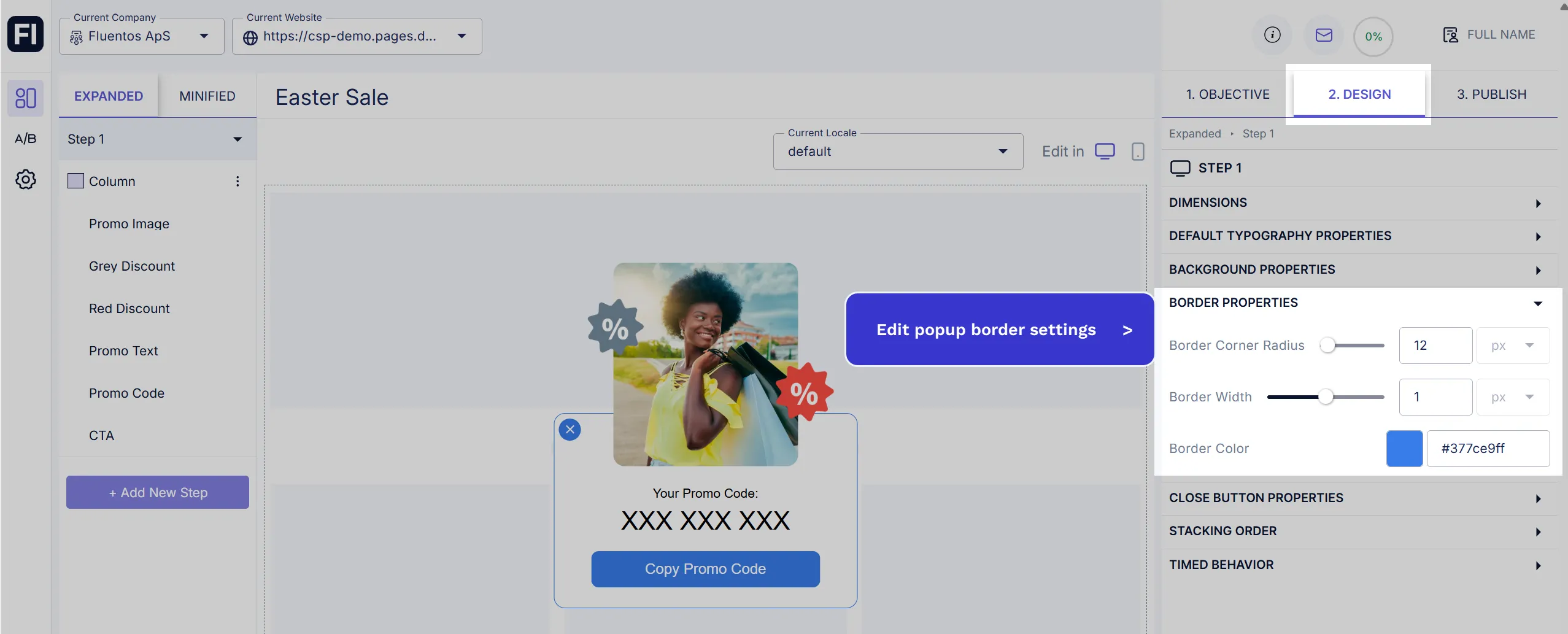
Section titled “Border Properties”You can set a border with the desired width, radius, and color.
- Border Corner Radius: Adjust the border radius by using the slider or the input numeric stepper. As you slide or increase/decrease a value, the changes can be previewed live on the screen for you to get a visual idea and decide the radius value.
- Border Width: If you don’t want a border, set it to zero (0). The maximum value can be 2.
- Border Color: Use the color picker or enter the hex code to set the color. If the border width is zero (0), the color won’t apply.
Close Button Properties
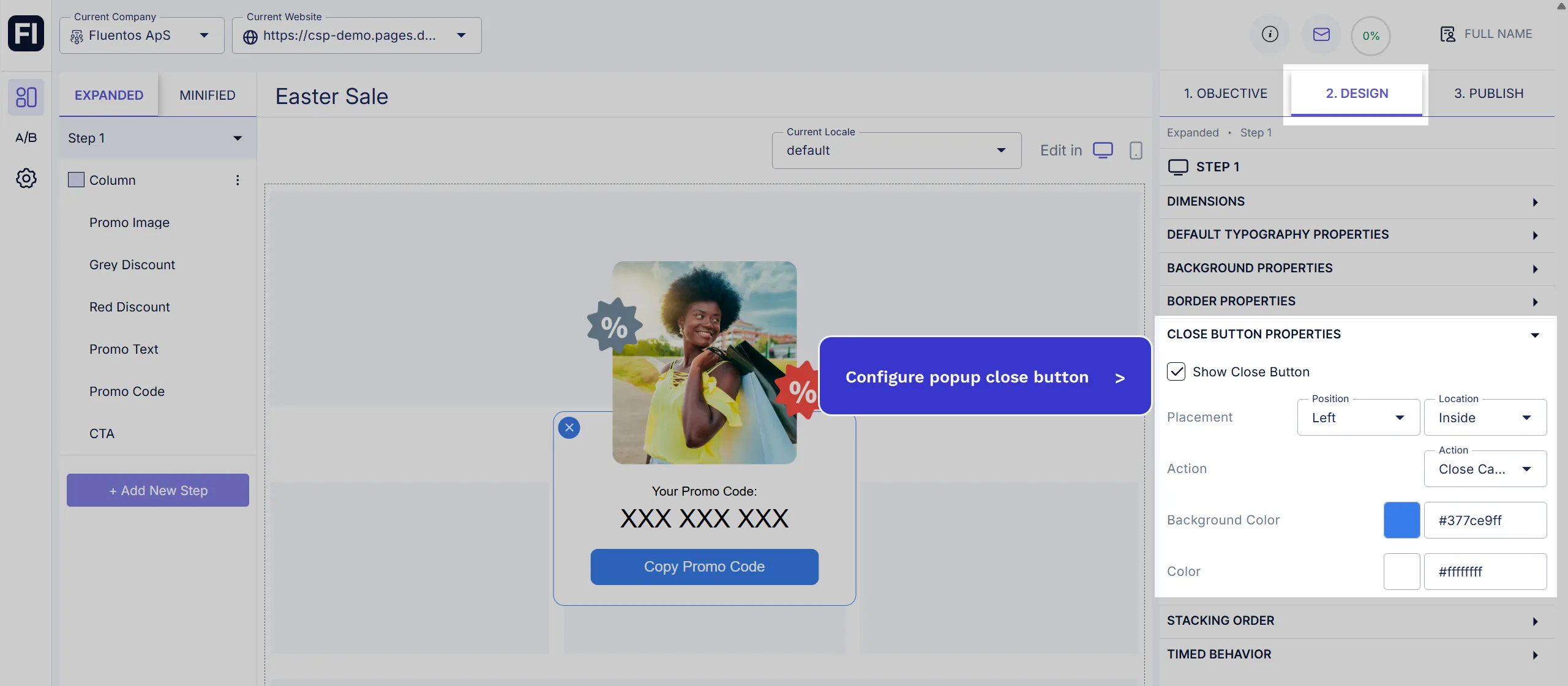
Section titled “Close Button Properties”It’s natural for the campaigns to have a close button for increased usability. However, if you don’t want one, you can uncheck the checkbox Show Close Button.
If your campaign has a close button, you can customize its following listed properties:
-
Placement: You can position it on the top right or top left corner of the step. Also, you can choose if you want to locate it inside or outside the campaign step radius.
-
Action: Define what the close button will do when clicked. Minify will simply minimize it, and it will reappear when the webpage is refreshed, whereas Close will close the campaign, and it will appear only if the Re-Engage trigger is set up for the campaign.
-
Background Color: The close button appears in a filled circle. You can select its color using the color picker or enter the hex code.
-
Color: This is the color of the cross icon. Set it in contrast to the close button background color so it is visible.
Stacking Order
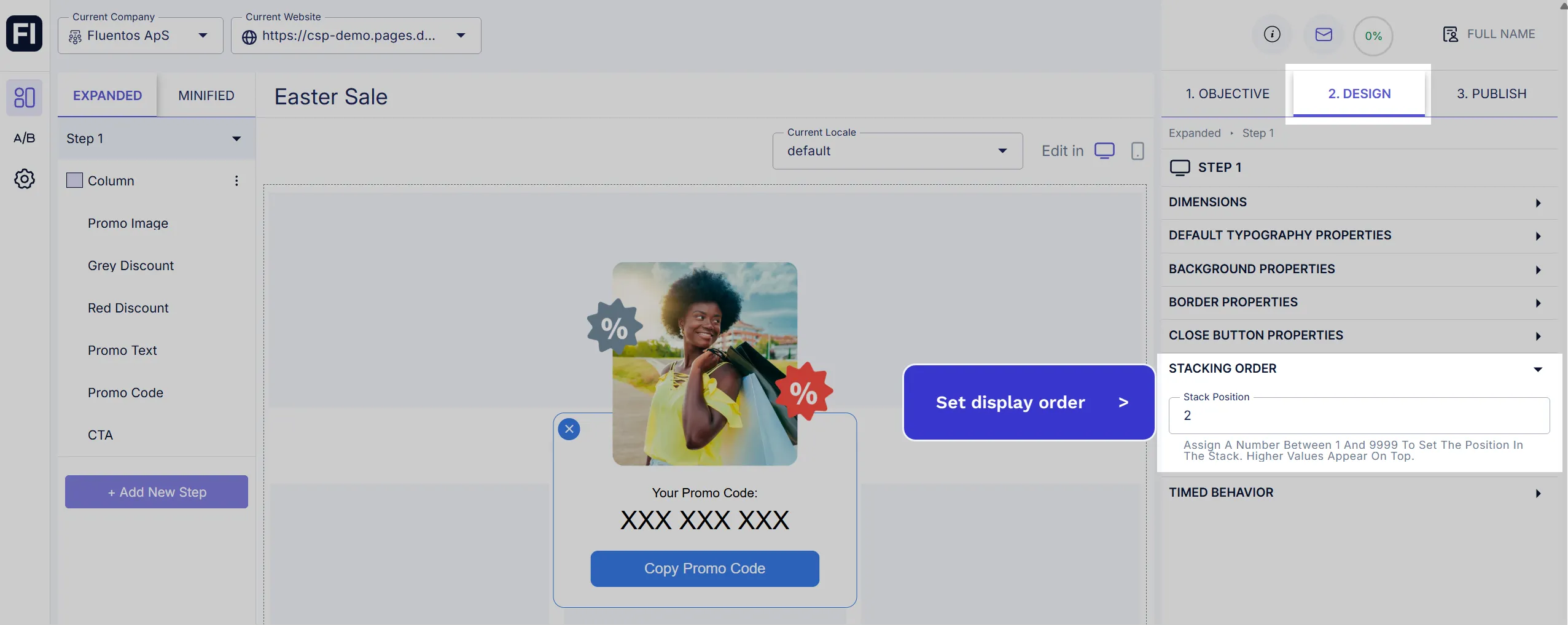
Section titled “Stacking Order”Stacking order is used to work correctly with your website elements. For example, if you have a campaign and your website has an overlay option, you can set the Stacking Order to be lower than the overlay to prevent the campaign from obstructing your website elements.
Please note that you should not confuse the Stacking Order with the campaign’s Priority settings, which are used to manage multiple campaigns running simultaneously.
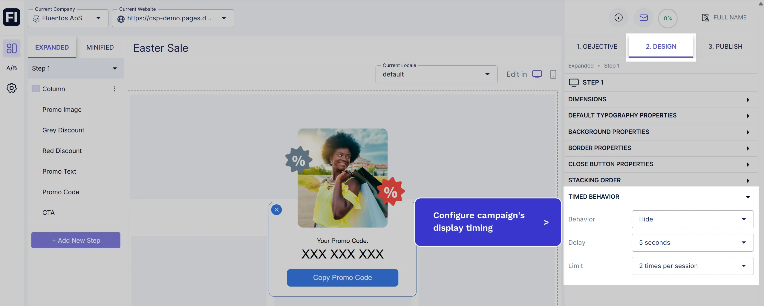
Timed Behavior
Section titled “Timed Behavior”You have control over the automated display behavior of your campaign step with the following configurable options.
- Behavior: Defines automated step behavior
- None: Default option, no automated behavior for the current step.
- Hide: Hides the campaign without triggering close callback.
- Close: Closes the campaign.
- Minify or Expand: Toggles between Minified and Expanded groups depending on which one is open.
- Delay: Wait time in seconds.
- Limit: Amount of times to perform timed behavior per user session.
