Countdown Timer
If you want to add a Countdown Timer to your campaign, you can add a widget to the campaign step layout section and configure it according to your preferences.
Steps to add a Countdown Timer
Section titled “Steps to add a Countdown Timer”-
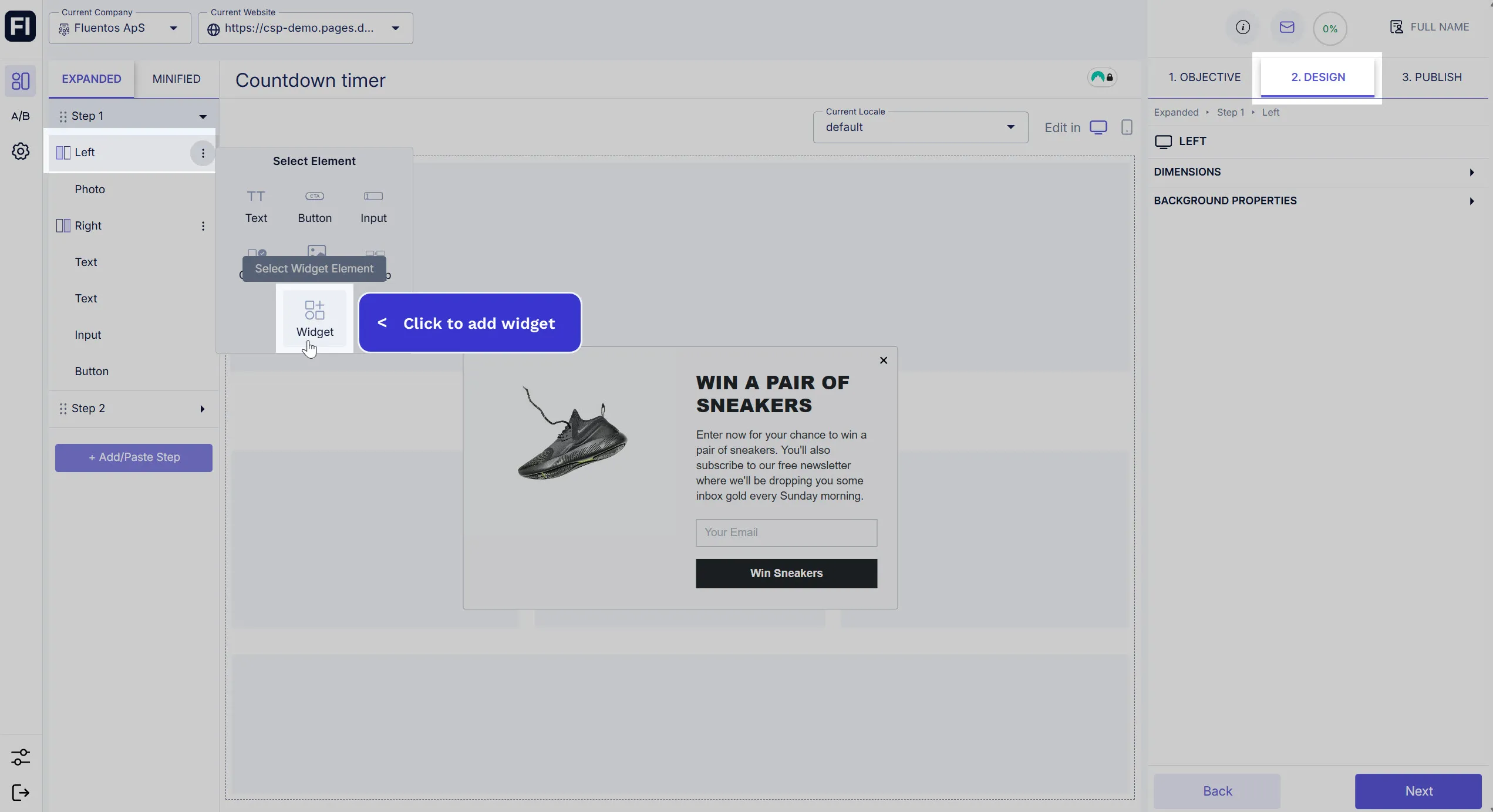
Add a widget to your campaign step by clicking on the three dots next to the container name (left/right/column) and selecting the Widget option from the available elements.
-
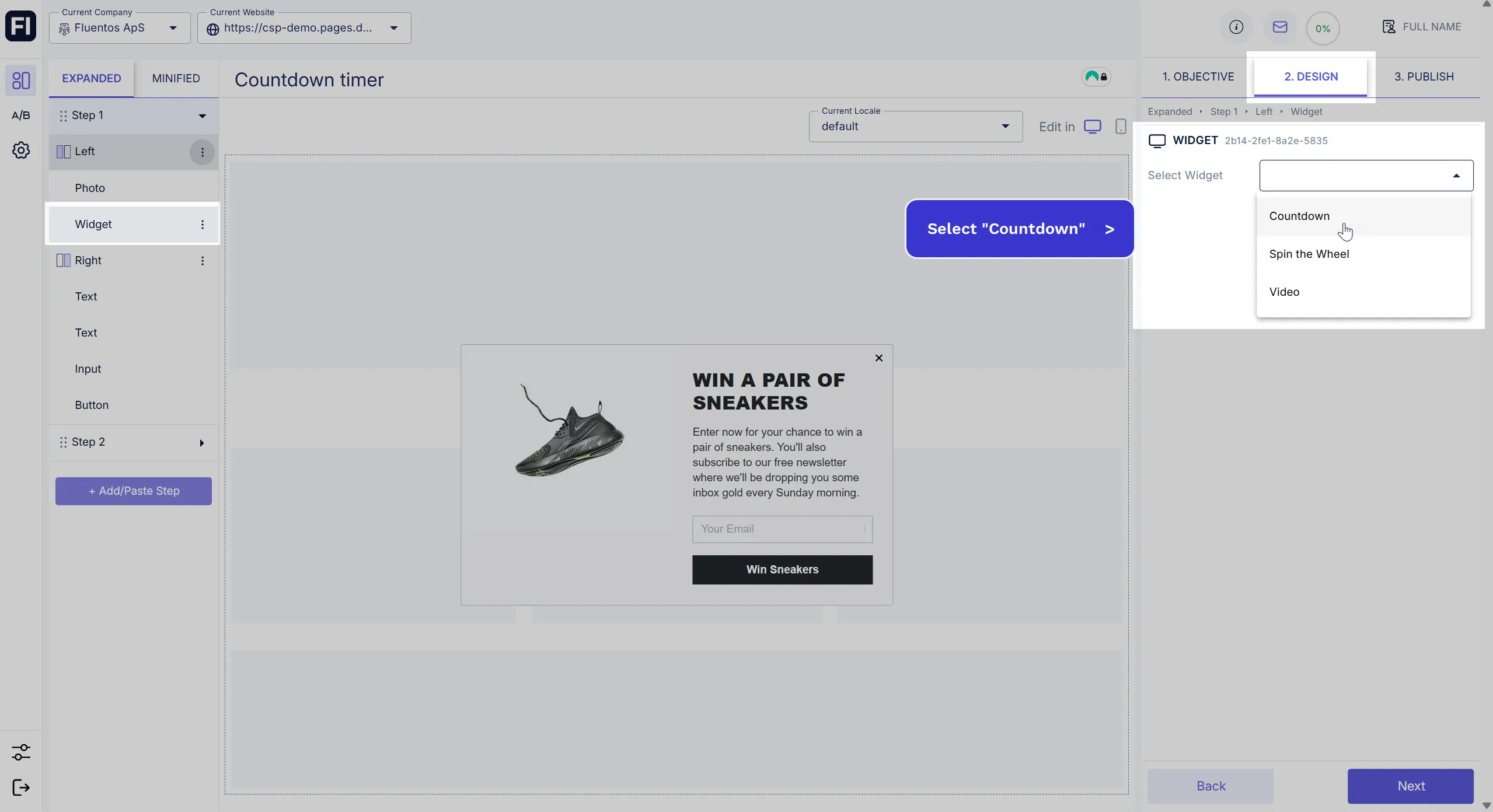
When the Widget element is added, use the dropdown and select Countdown in the right panel.
-
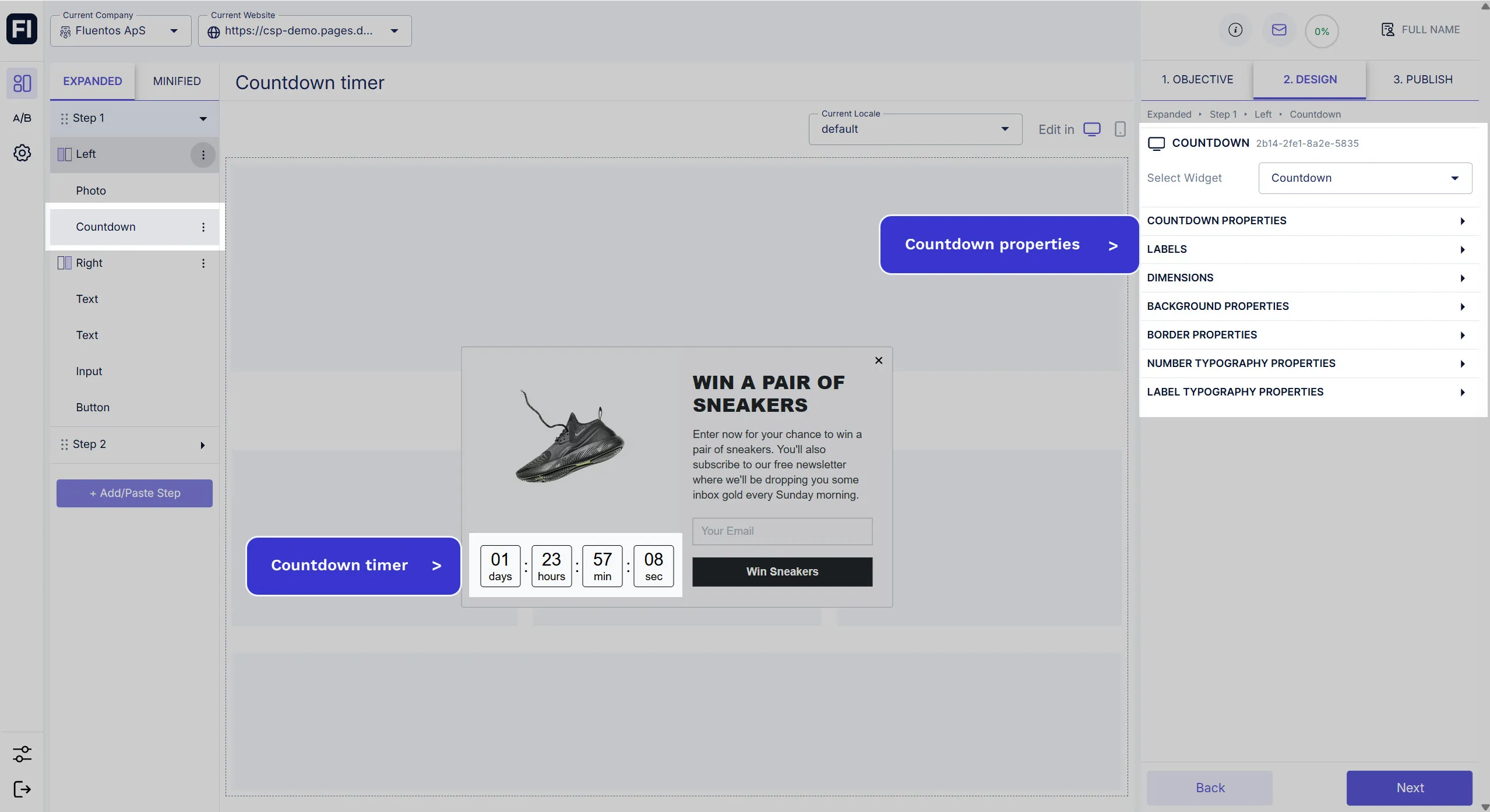
The Countdown Timer will be added to your layout section. Its default name will be “Countdown,” which you can change.
Set Time & Date
Section titled “Set Time & Date”The first thing you should do right after adding the Countdown Timer widget to your design is to set its time so you can see it in action. It’s usually used to increase sales by creating a sense of urgency, so a shorter time is advisable.
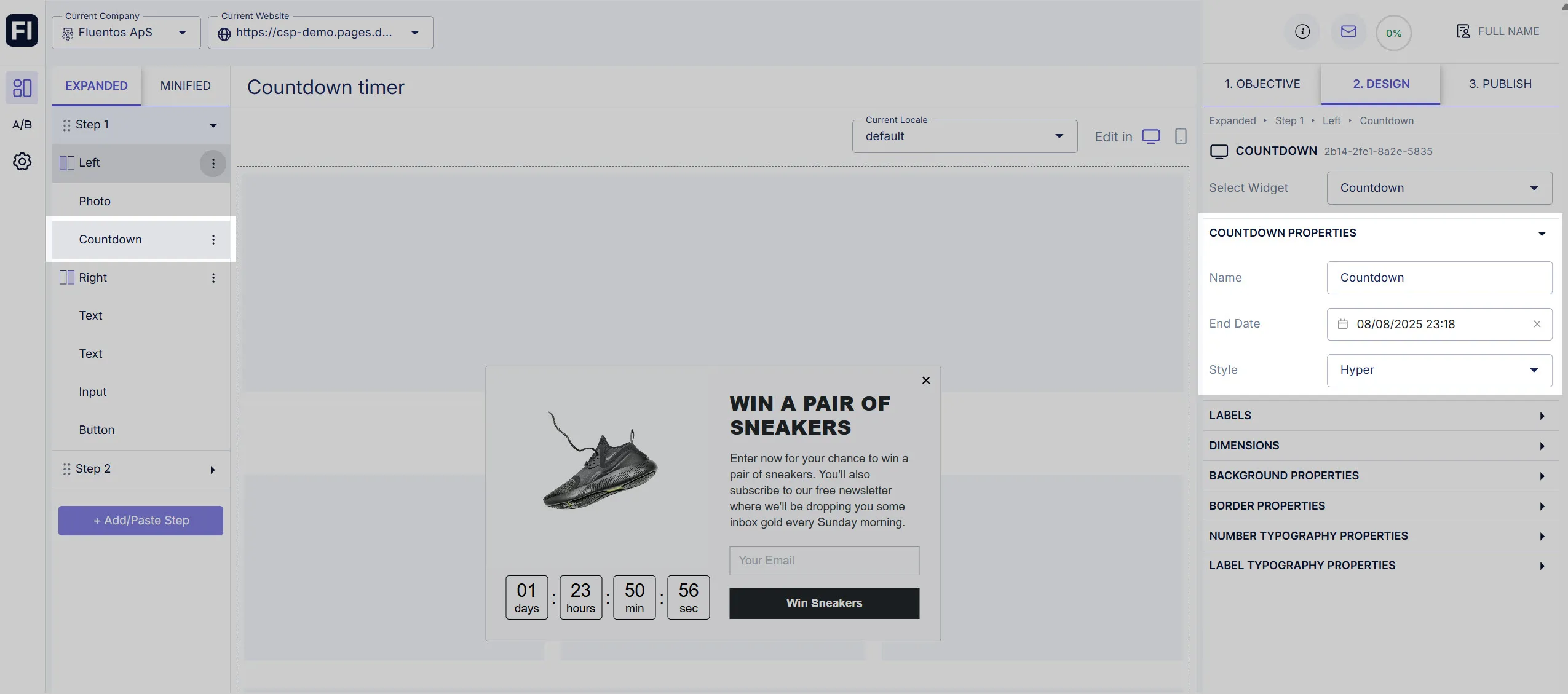
To configure its time and date, expand the Countdown Properties available in the right panel, and you will see the following options:
- Name: Edit the Countdown Timer name. It’s just for the campaign settings and is not displayed to the users.
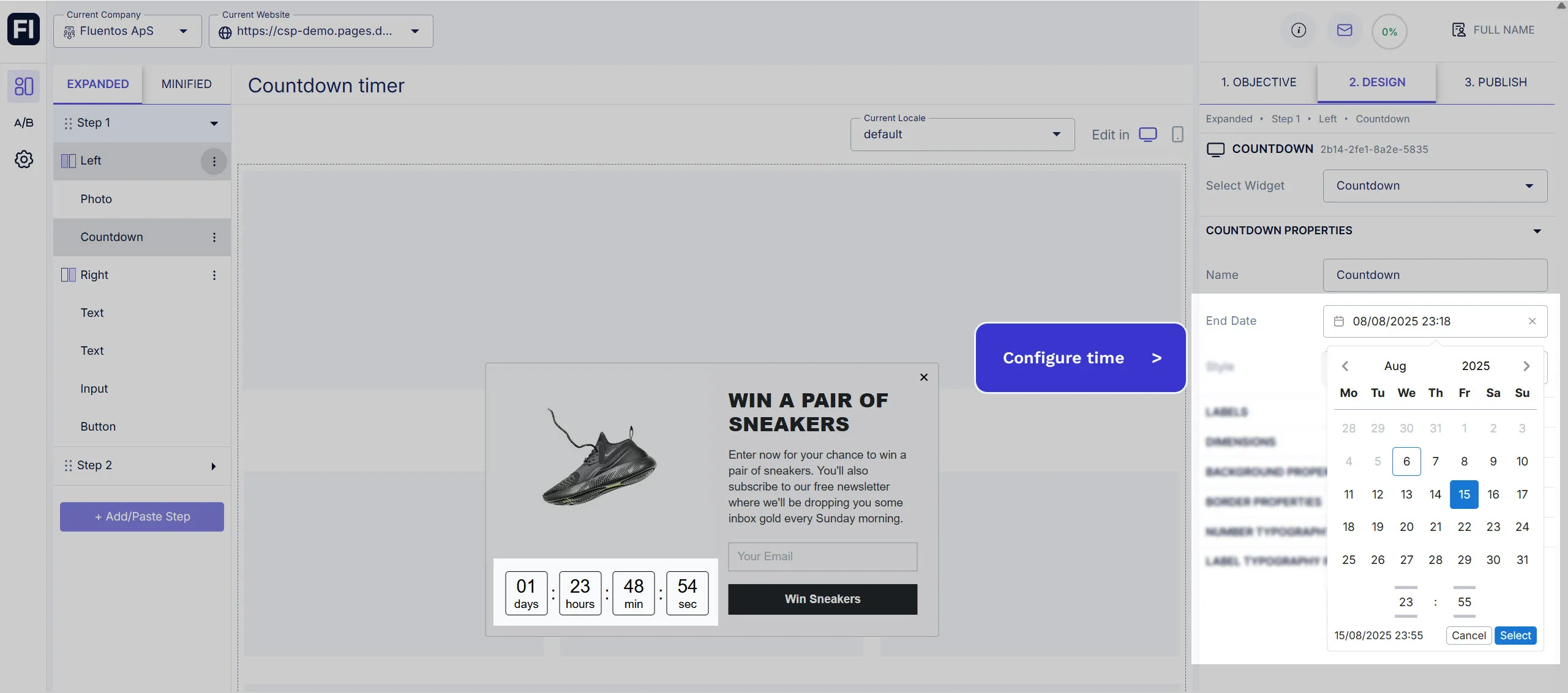
- End Date: Select the end date and time using the calendar icon.
- Style: You can choose between
NoneandHyper. Hyper adds the double colons to the time formatting, whereas None is time formatting without double colons.
Example
Section titled “Example”If we want to set the timer only for four days, and today is the 29th of December 2024 according to our timezone, then we will select the 2nd of January 2025, and configure the hours and minutes as required, along with the appropriate AM/PM mode selection.
Timer Expiration
Section titled “Timer Expiration”Once the timer expires, the campaign will close.
Styling Properties
Section titled “Styling Properties”The following styling properties can be customized for the Countdown Timer:
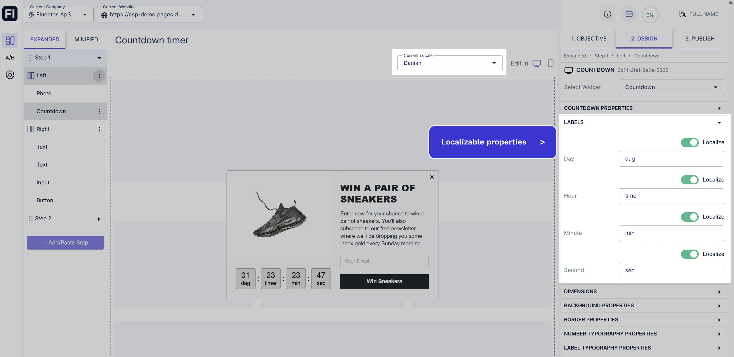
Labels
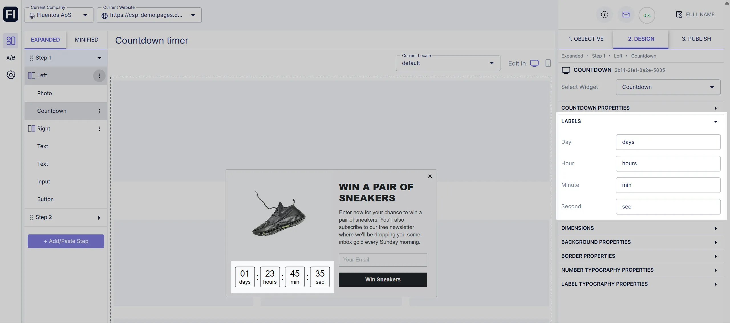
Section titled “Labels”In this section, you can edit the time labels for all four components of time:
- Day: Default value:
days - Hour: Default value:
hours - Minutes: Default value:
min - Seconds: Default value:
sec
Dimensions
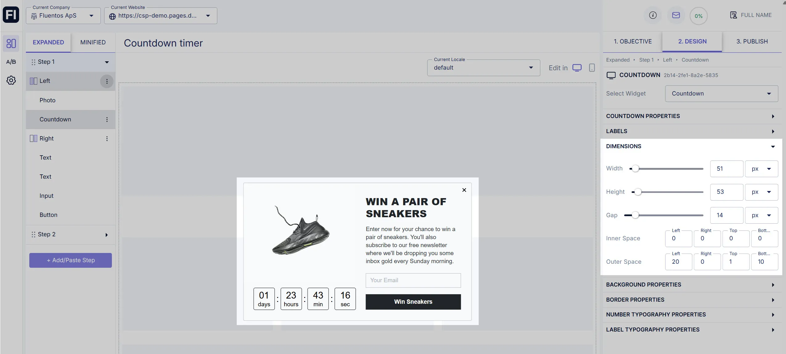
Section titled “Dimensions”Here, you can configure the dimensions of the timer as well as its positioning and placement. Customizable options are:
- Width: Changes the overall width of the Countdown Timer.
- Height: Changes the overall height of the Countdown Timer.
- Gap: This enables you to increase or decrease the gap or distance between the time elements (days/hours/mins/secs).
- Inner Space: Increase/decrease the padding of time digits from its four dimensions. Using this, you can adjust the placement of time digits within the Countdown widget.
- Outer Space: Increase/decrease the Countdown Timer’s outer distance from its borders to its container. This allows you to adjust the timer’s placement and positioning inside the layout section.
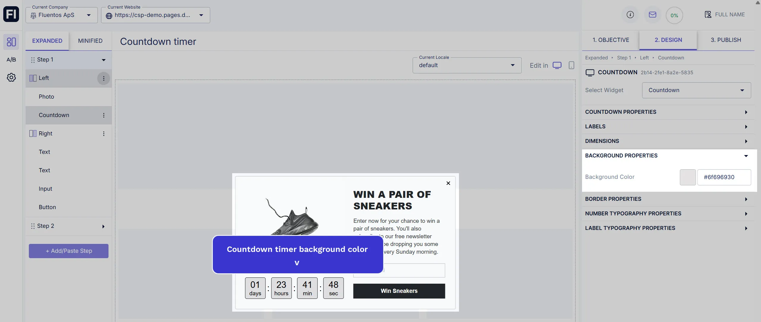
Background Properties
Section titled “Background Properties”You can also customize the background color of the Countdown Timer in Fluentos. Use the color picker or enter the hex code for your desired color.
Border Properties
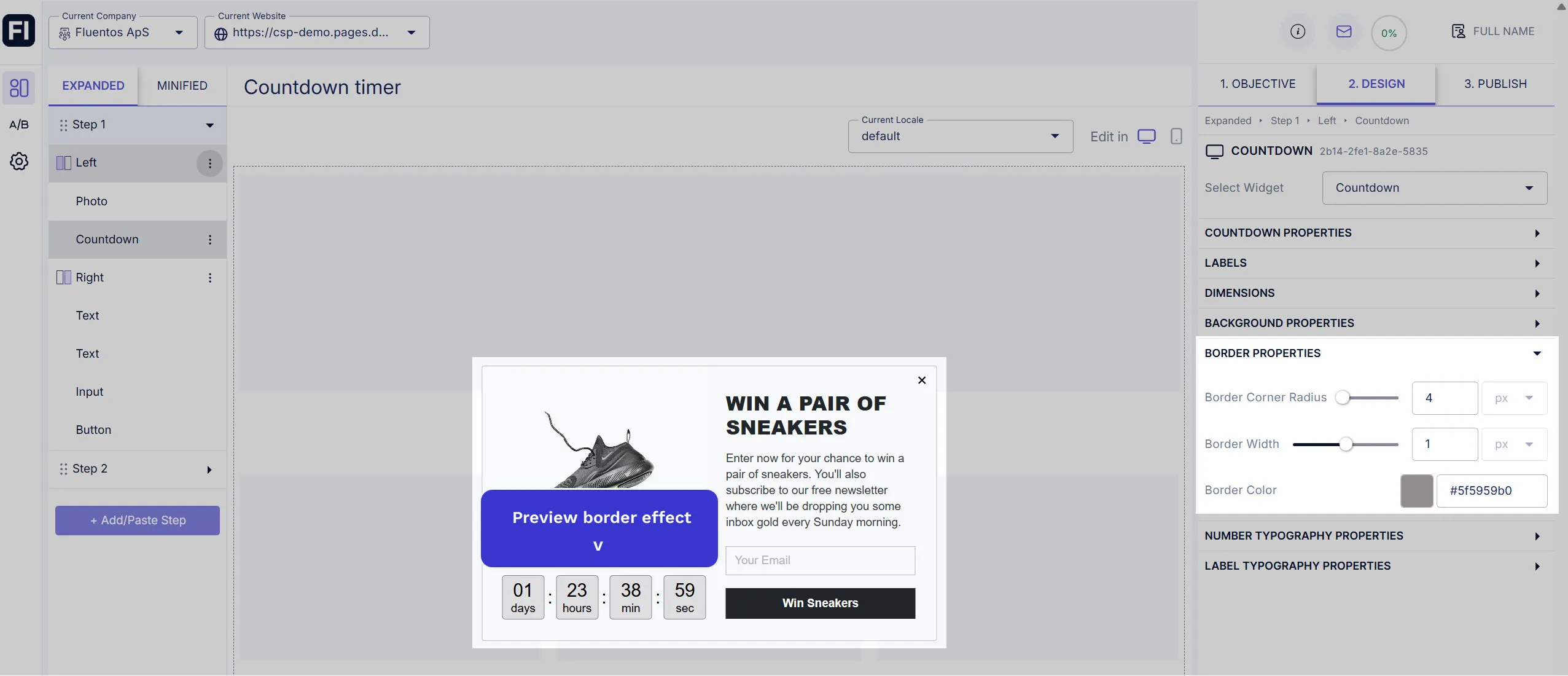
Section titled “Border Properties”Customize the Countdown Timer border by adjusting the following attributes:
- Border Corner Radius: Value ranges from 0 - 100. It allows you to round the border corners.
- Border Width: Value ranges from 0 - 2. It enables you to define the border thickness.
- Border Color: The border color can be different from the Countdown Timer’s background color. The color will be visible only when the border width is set to a non-zero value.
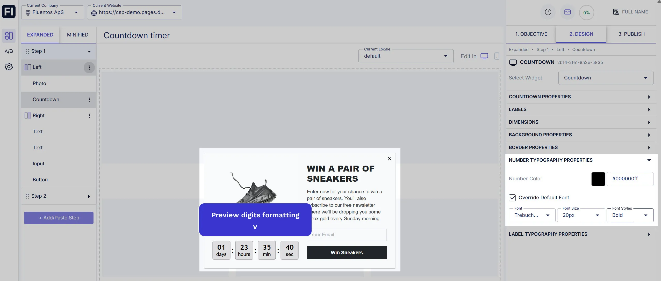
Number Typography Properties
Section titled “Number Typography Properties”In this section, you can customize the font color of the time digits. If you use the Hyper style of the Countdown Time, the color you select here will also be applied to the double colons between the time digits.
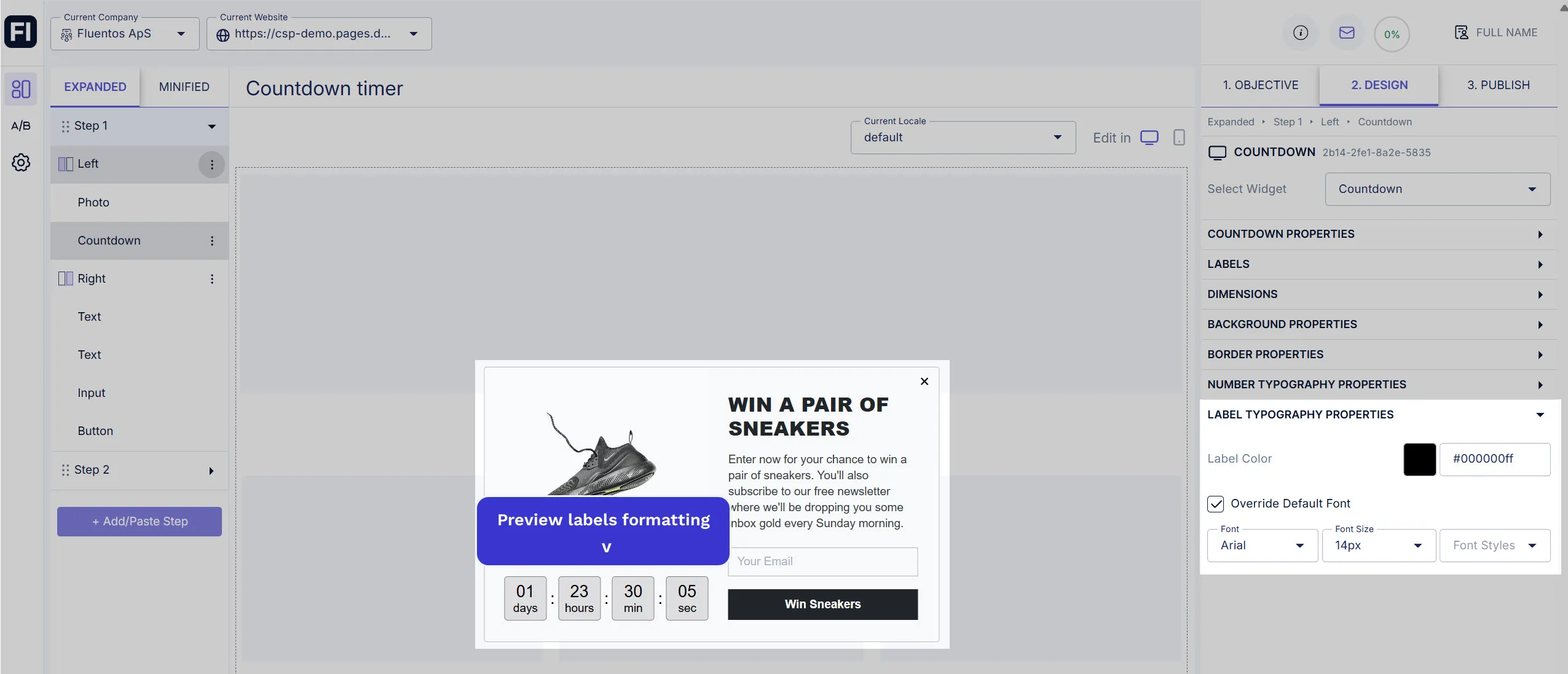
Label Typography Properties
Section titled “Label Typography Properties”You can customize the font color of the time labels (day/hour/min/sec) here.
Localizable Properties
Section titled “Localizable Properties”You can localize the labels of the countdown timer.
