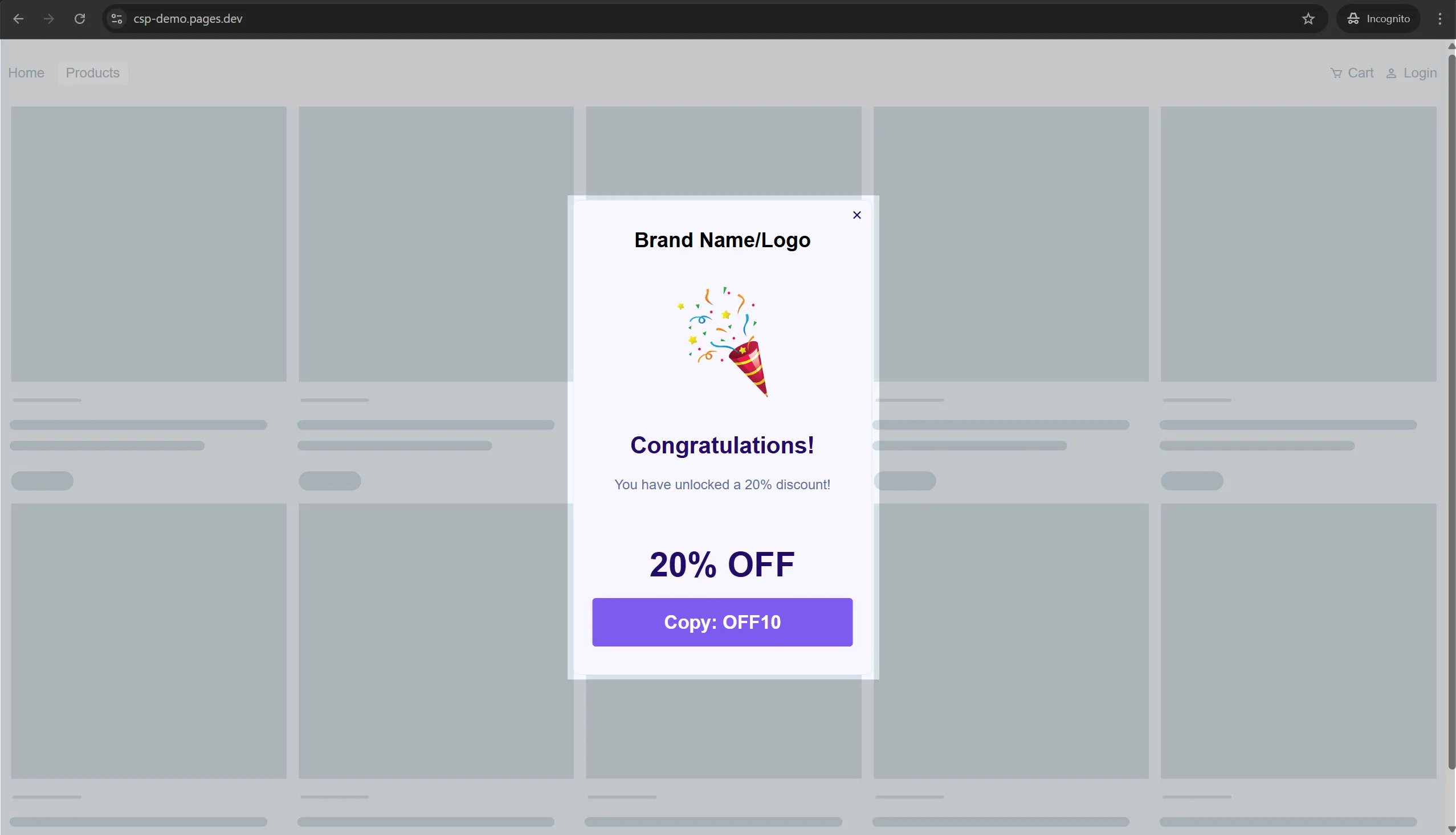
Scratch The Card
Just like Spin the Wheel, you can also add a “Scratch the Card” game to your campaign and make it even more exciting and engaging. After all, everyone loves a little magic and pleasant surprises.
Triggering Scratch the Card Game
Section titled “Triggering Scratch the Card Game”You need to add a scratch surface image and set the Scratch Completion percentage (%) to identify scratch completion point and display the results.
The Flow
Section titled “The Flow”Once the scrach is completed, the result is displayed to the end user in the next step. If configured, the result will also be pushed to your integration at this point.
Game Logic
Section titled “Game Logic”You can add as many prizes as you like, and each prize will be selected based on its probability. The more prizes you add, the more dynamic the game feels.
Here’s why: the system automatically fills “no win” cards with other prize cards up to (matches needed to win – 1). For example, if a user needs 3 matching cards to win, they might see 2 matching cards for another prize. This creates a teasing effect that keeps the game engaging without guaranteeing a win.
Cheating
Section titled “Cheating”The outcome of each game is determined and stored the moment the user starts scratching. If they refresh or reload the page, they’ll get the same result, just shuffled into a new arrangement. This prevents users from trying to cheat by reloading to get a better outcome.
Steps to add Scratch the Card
Section titled “Steps to add Scratch the Card”-
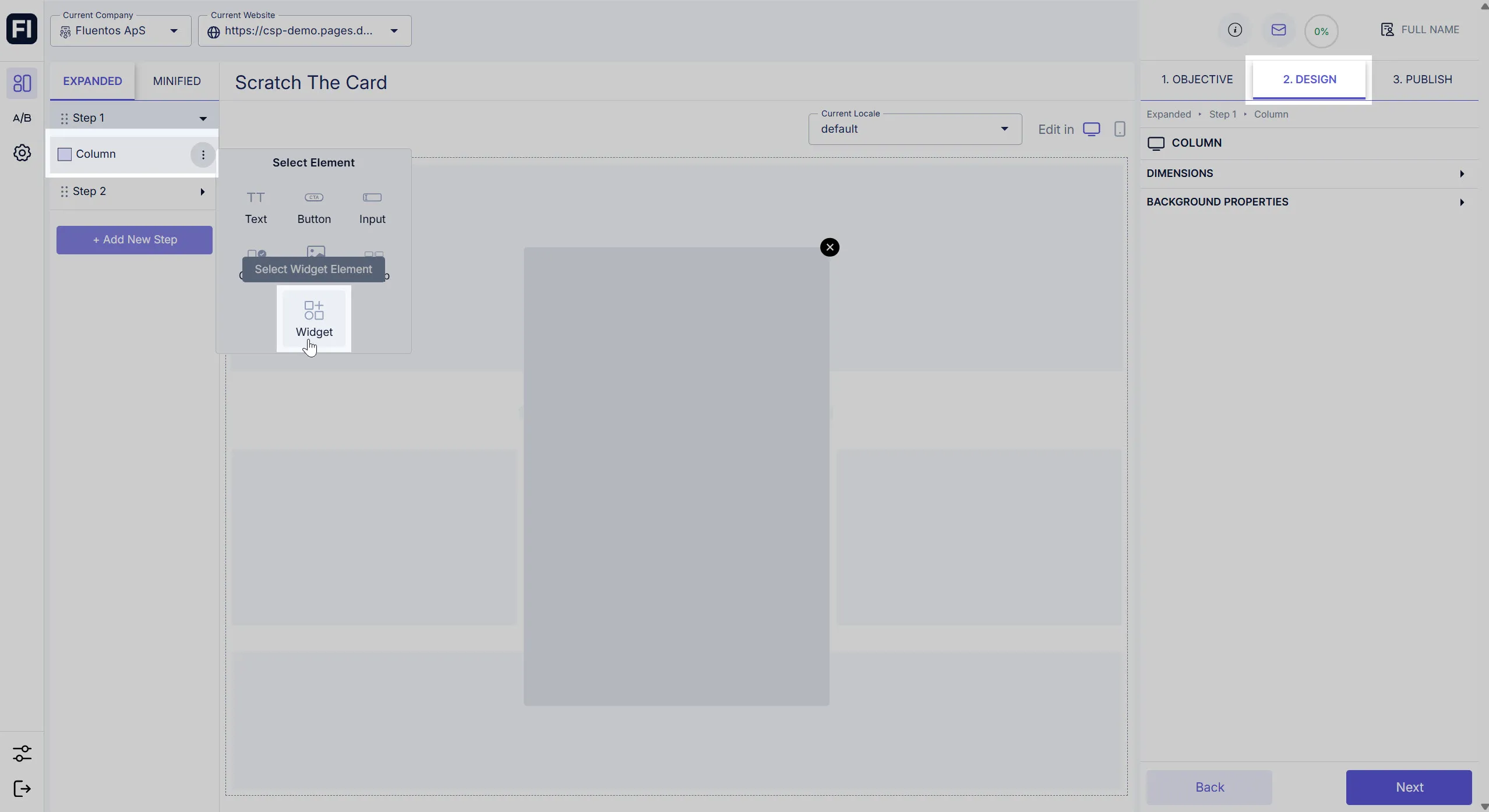
Click the three dots against the step layout section to which you want to add Spin The Wheel, and select Widget. For example, the Widget is added to the Step 1 column in the image shared below.
-
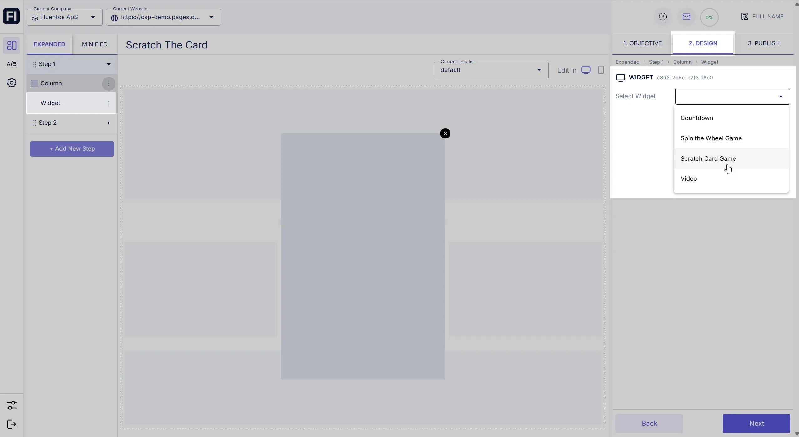
Once the Widget is added to the layout, click on it and select Scratch Card Game from the dropdown that appears on the Design tab in the right panel.
-
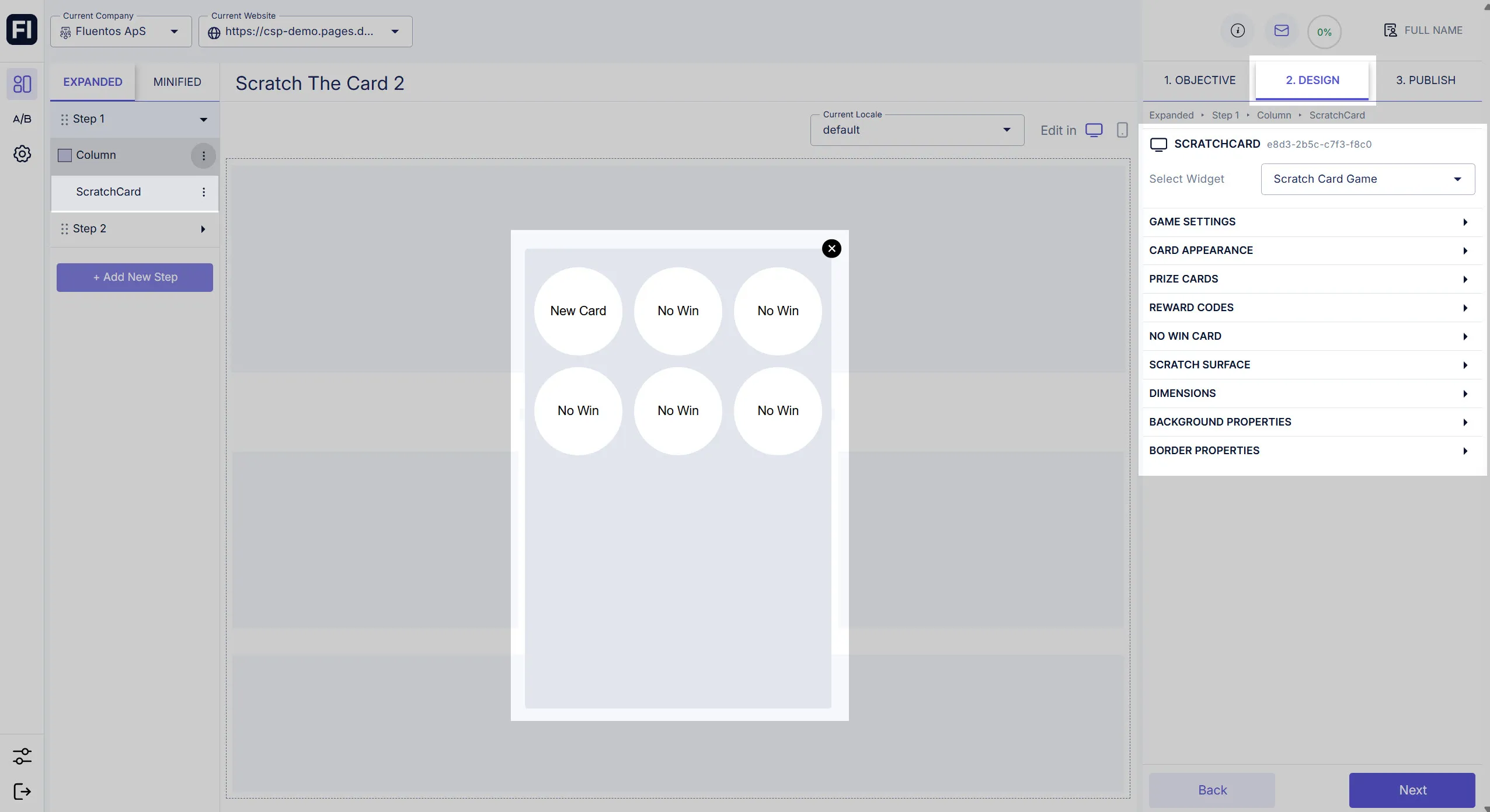
When you select, the Scratch Card Game is added to the layout container. The Widget is renamed to ScratchCard. Its configurable properties become available on the Design tab in the right panel.
Game Settings
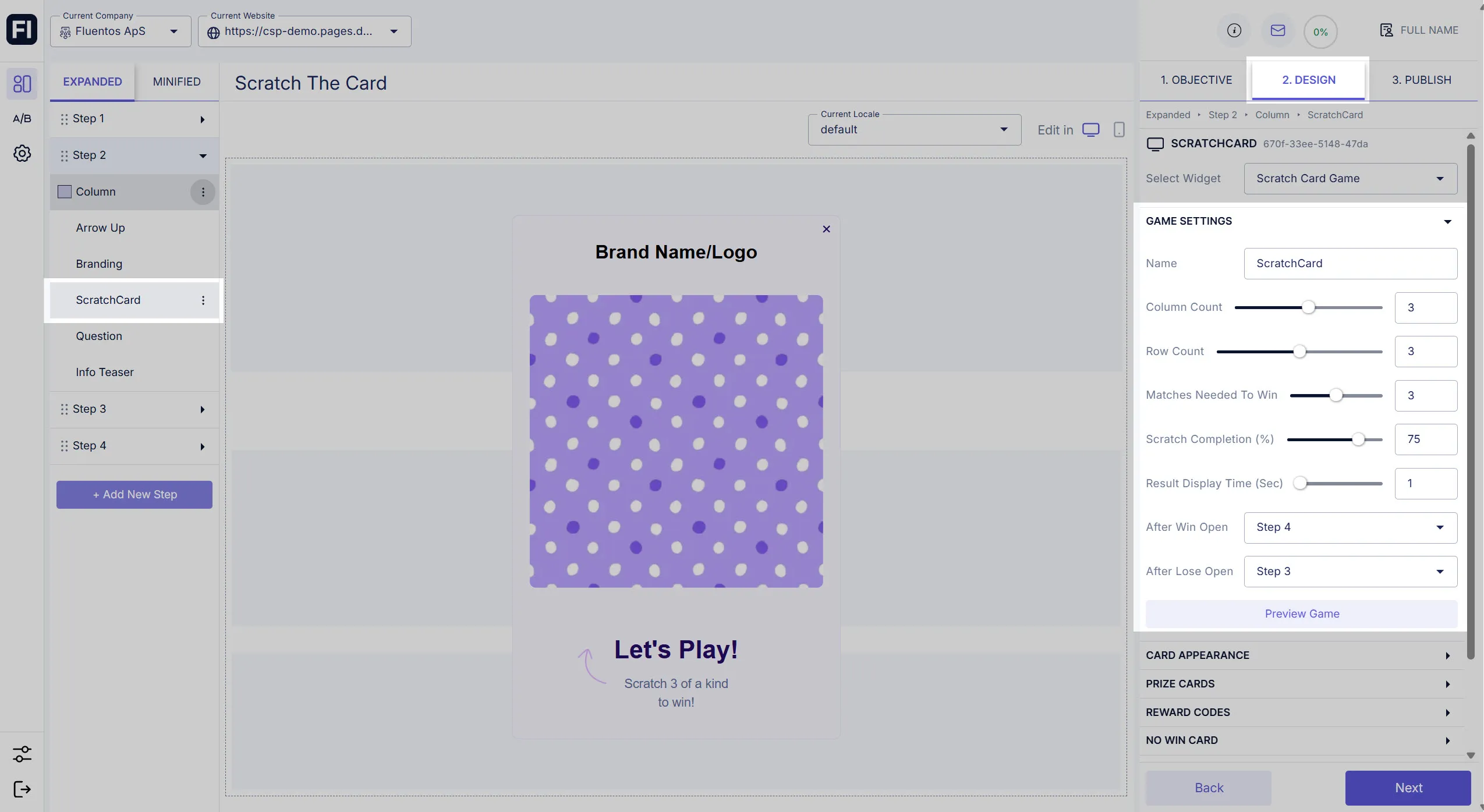
Section titled “Game Settings”Under Game Settings, the following customizable options are available.
- Name: It’s the name of the design element. By default, it’s set to “ScratchCard”.
- Column Count / Row Count: The number of cards that you want to display can be configured by defining the number of columns and rows. The largest allowed combination is 5 x 5.
- Matches Needed to Win: Define the number of cards that should be matched for a user to win.
- Scratch Completion (%): Define the percentage of the image surface that should be completed to reveal results.
- Result Display Time (Sec): Here you can add a delay in displaying the result after the scrach percentage is completed. For example, you set it to 1 second to allow to check the revealed results.
- After Win Open: Select the campaign step that should be displayed if the user wins the game. For example, if the card matches needed to win were 3, and 3 matching cards appeared for the user scratching the card, so the user won the game.
- After Lose Open: Select the campaign step that should be displayed if the user loses the game. For example, if the card matches needed to win were 3, and only 2 matching cards appeared for the user scratching the card, so the user lost the game.
Card Appearance
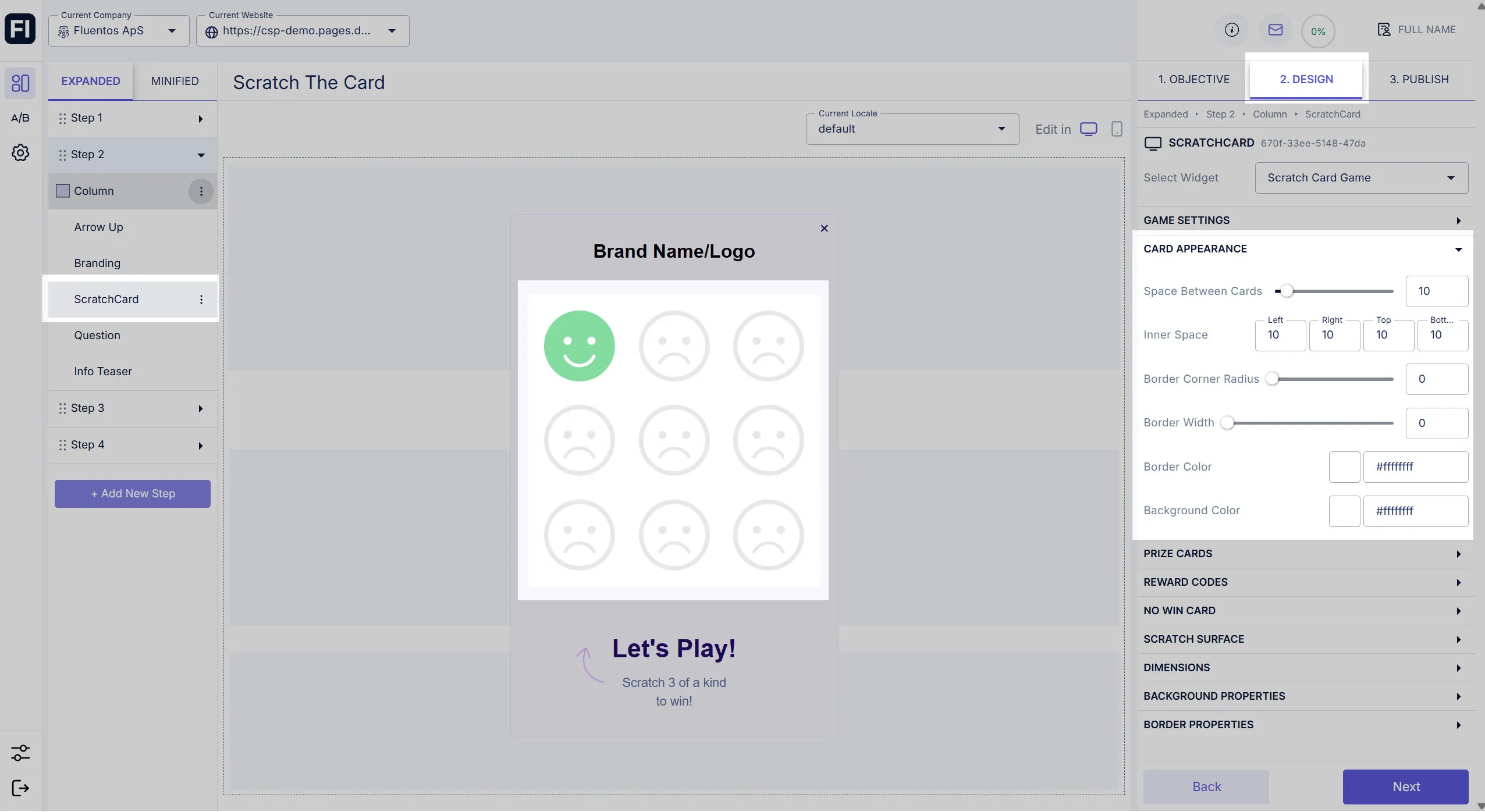
Section titled “Card Appearance”The following settings are applied to all the cards that you add to your game, and therefore, all the cards of that game will share the same properties/appearnce, except for the case when you enable the Orverride Background option for Prize Cards or No Win Card.
- Space Between Cards: Define the distance between the cards when these are displayed in the column.
- Inner Space: Increase/decrease the padding of the card element from its four dimensions. Using this, you can adjust the placement of the text/image within the card placeholder.
- Border Corner Radius: Value ranges from 0 - 100. It allows you to round the border corners of the card.
- Border Width: Value ranges from 0 - 2. It enables you to define the border thickness.
- Border Color: The border color can be different from ScratchCard background color. The color will be visible only when the border width is set to a non-zero value.
- Background Color: You can also customize the background color of the card. Use the color picker or enter the hex code for your desired color.
Prize Cards
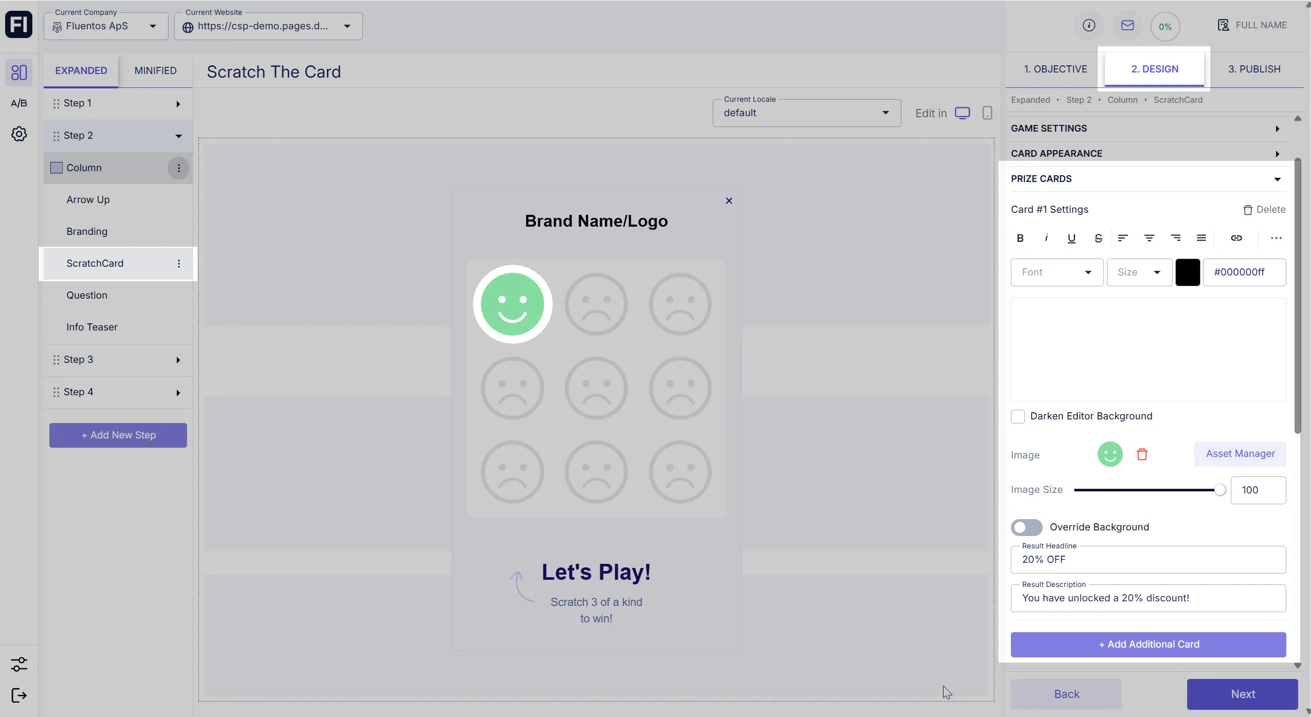
Section titled “Prize Cards”Under this section, you can configure how your prize cards should be displayed. You can either add a text or a desired image or your company logo.
- Result Headline: Here you can enter the text that will be displayed as a prize headline when the user wins the game for the card.
- Result Description: If you want to add details of the prize, here you can do so. It will appear under the
Result Headline.
Reward Codes
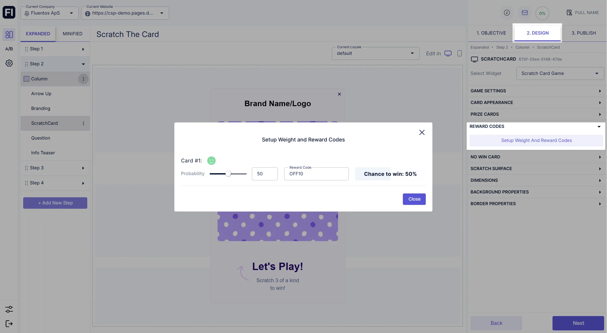
Section titled “Reward Codes”Under this section, you can configure the winning probability of each card by setting their weightage (%). You also need to assign each card a unique reward code that will be displayed to the winners for claiming their prize.
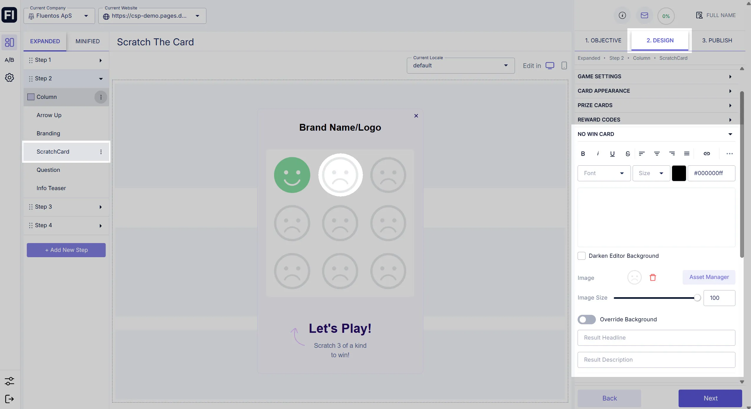
No Win Card
Section titled “No Win Card”Here, you can define how the no-win card should look like and what should be displayed when the user loses the game.
For example, you created only one prize card and set its winning probability to 50%, then the remaining 50% of the times, a no-win card will be displayed.
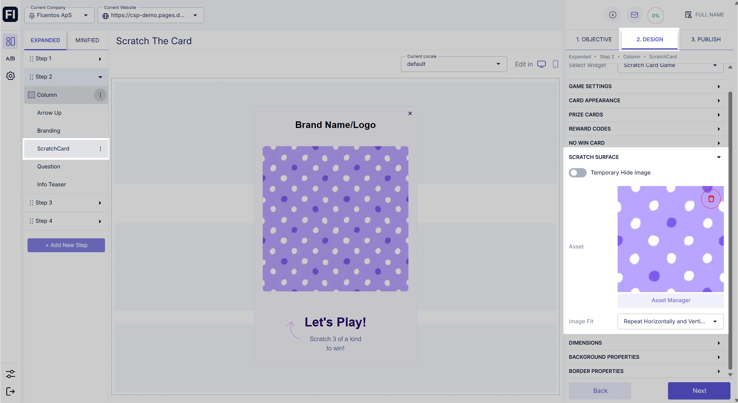
Scratch Surface
Section titled “Scratch Surface”Add the image that you want to be displayed for the user to scratch and reveal the results.
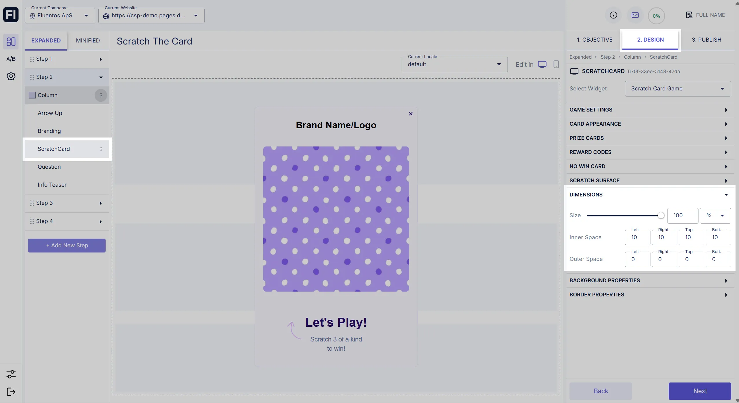
Dimensions
Section titled “Dimensions”Here, you can configure the size and the placement of the Scract the card game widget in your campaign step.
- Size: Move the slider to the right or left to increase or decrease the widget size.
- Inner Space: Use the four-dimension counters to adjust the placement of the card/cards within the widget by changing its/their outer distance from the four sides.
- Outer Space: Use the four-dimension counters to adjust the placement of the widget to its layout section by changing its outer distance from the four sides.
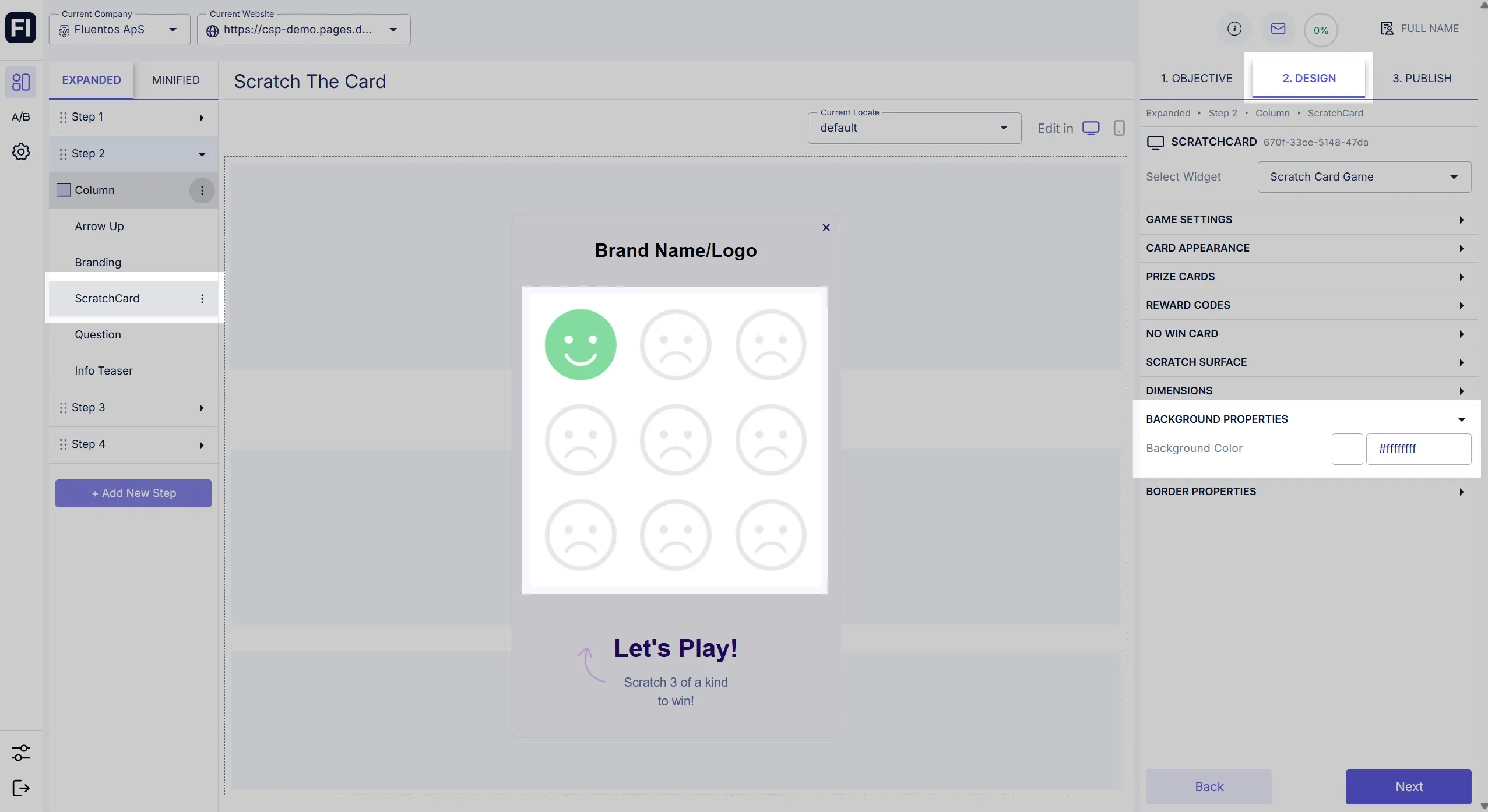
Background Properties
Section titled “Background Properties”Use this option to set a specific color for the widget background.
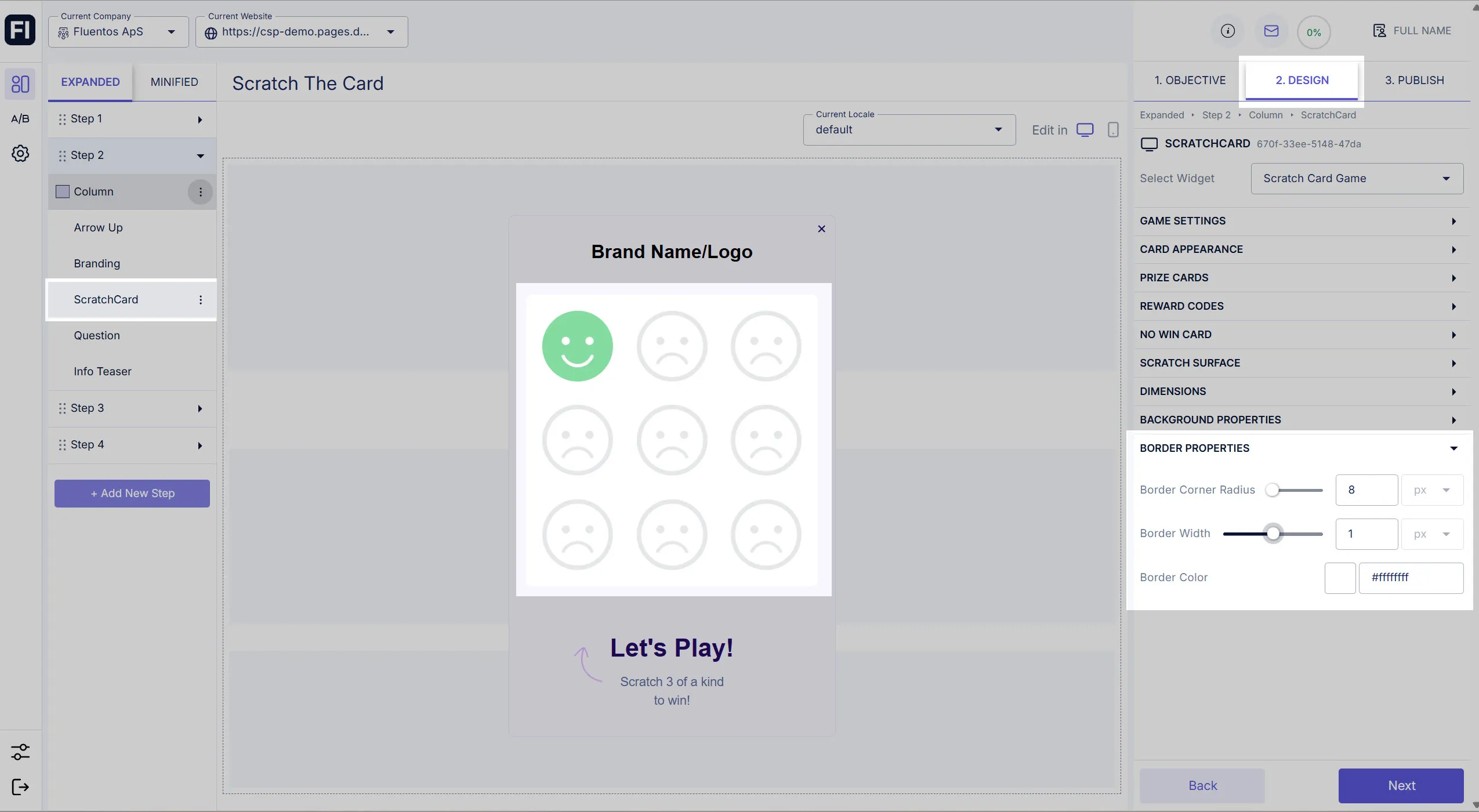
Border Properties
Section titled “Border Properties”Customize the ScracthCard widget border by adjusting the following attributes:
- Border Corner Radius: Value ranges from 0 - 100. It allows you to round the border corners.
- Border Width: Value ranges from 0 - 2. It enables you to define the border thickness.
- Border Color: The border color can be different from the card’s border or background color. The color will be visible only when the border width is set to a non-zero value.
Live Data
Section titled “Live Data”Every prize has three elements that can be used with the Datahub display and further Step display.
WINNER_HEADLINE
Section titled “WINNER_HEADLINE”{{datahub:WINNER_HEADLINE:You won 20%}}WINNER_DESCRIPTION
Section titled “WINNER_DESCRIPTION”{{datahub:WINNER_DESCRIPTION:Use this code in the checkout}}WINNER_CODE
Section titled “WINNER_CODE”Inside the step display:
{{datahub:WINNER_CODE:FREE TSHIRT}}Inside the integration:
{{datahub:WINNER_CODE}}Demonstration
Section titled “Demonstration”The images shared below are just an example of how the ScratchCard widget can be configured and function on the front-end of a webpage.
Image 1: You can either display the ScratchCard game in the first step of your campaign or if you want to collect users’ data, you can add a form in the first step and an action button which when clicked will display the game step. For example, the image shared below.
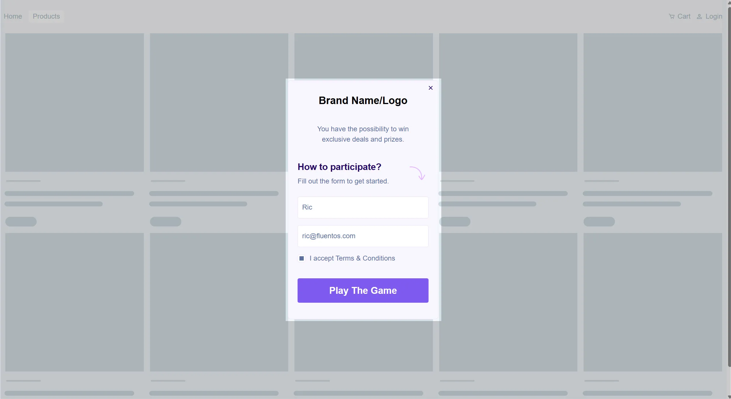
Image 2: This image shows how the surface will be scratched and the cards will be revealed accordingly.
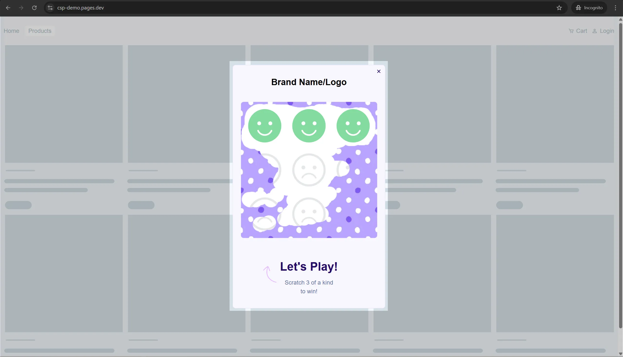
Image 3: The following image demonstrates how the results will be displayed. Upon winning, the user will be shown the step that was configured for the winners.
