Spin the Wheel
You can design Spin the Wheel from scratch or use a pre-made template. Whichever option you use, the same styling and functionality properties are available for you to configure.
Triggering Spin The Wheel
Section titled “Triggering Spin The Wheel”You need a button with Action Submit and Publish or Submit and Next Step to start the spin.
The Flow
Section titled “The Flow”Once the wheel finishes, the end user should proceed to the next step to claim the prize. If configured, the result has already been pushed to your integration at this point.
Pre-made templates
Section titled “Pre-made templates”1. Classic Style Template
Section titled “1. Classic Style Template”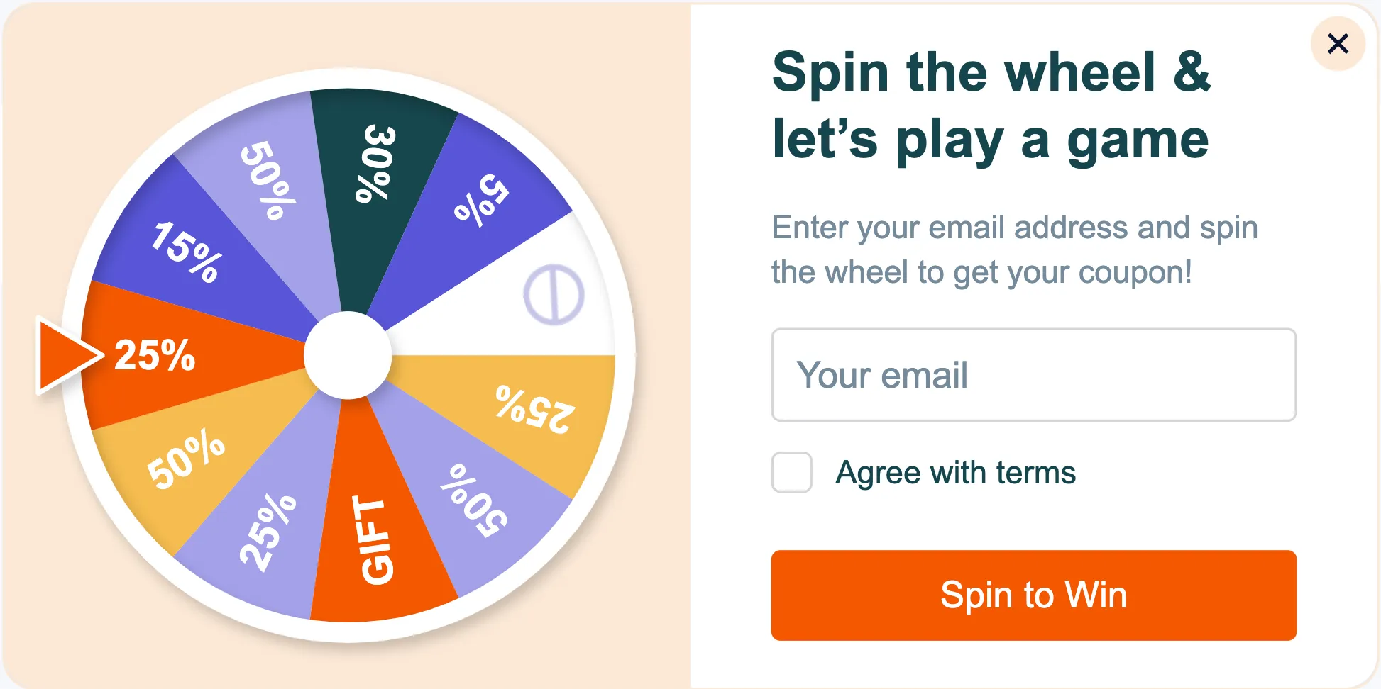
2. Leaf Style Template
Section titled “2. Leaf Style Template”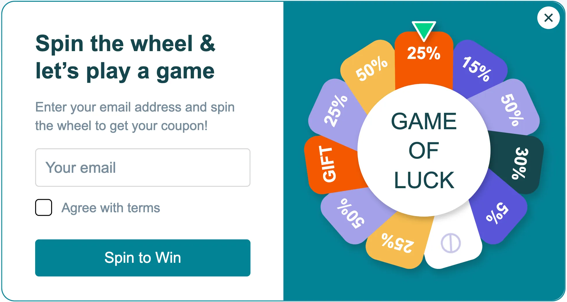
Steps to add a Spin The Wheel
Section titled “Steps to add a Spin The Wheel”-
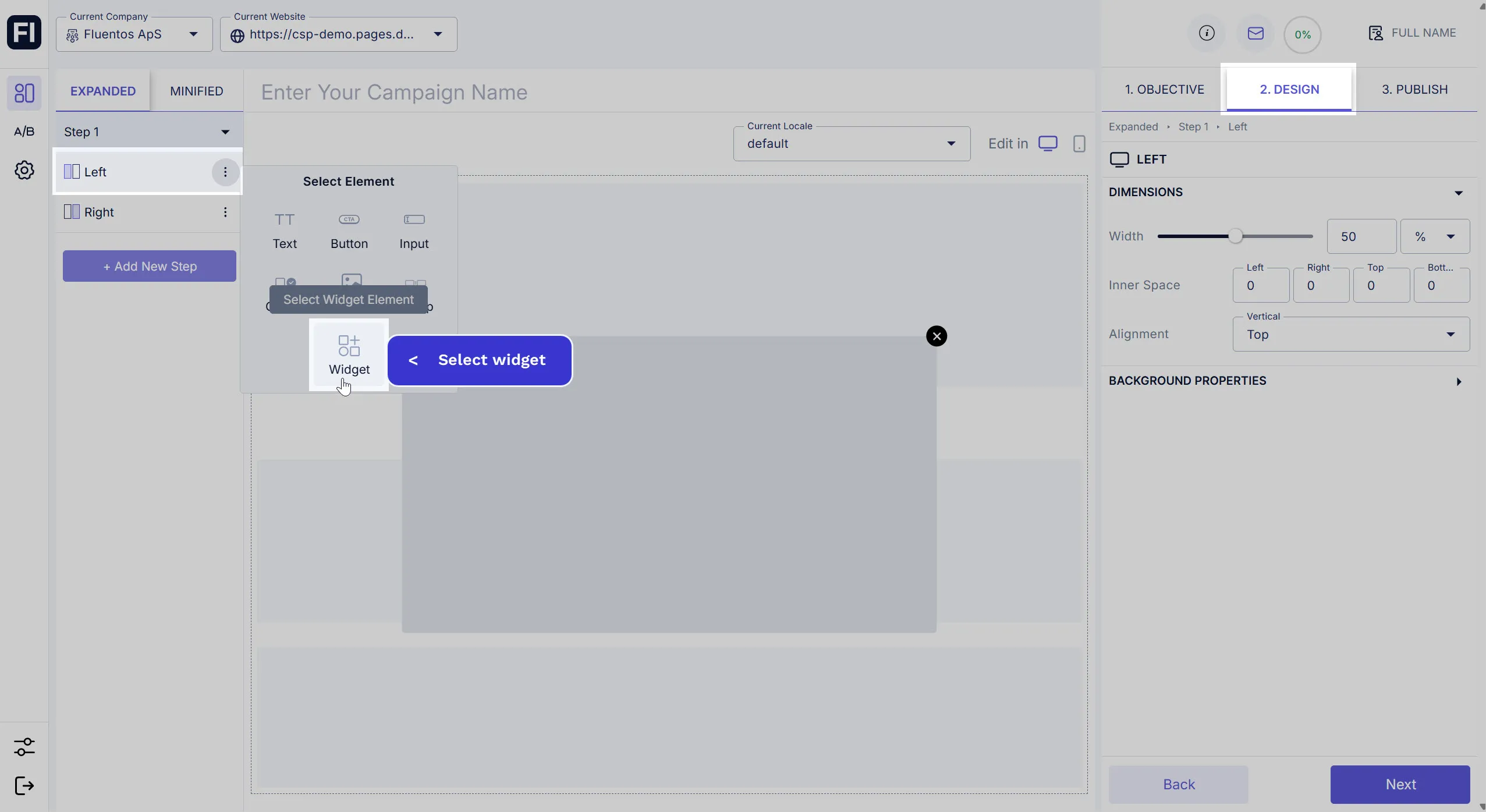
Click the three dots against the step layout section to which you want to add Spin The Wheel, and select Widget. For example, the Widget is added to the Left column in the image shared below.
-
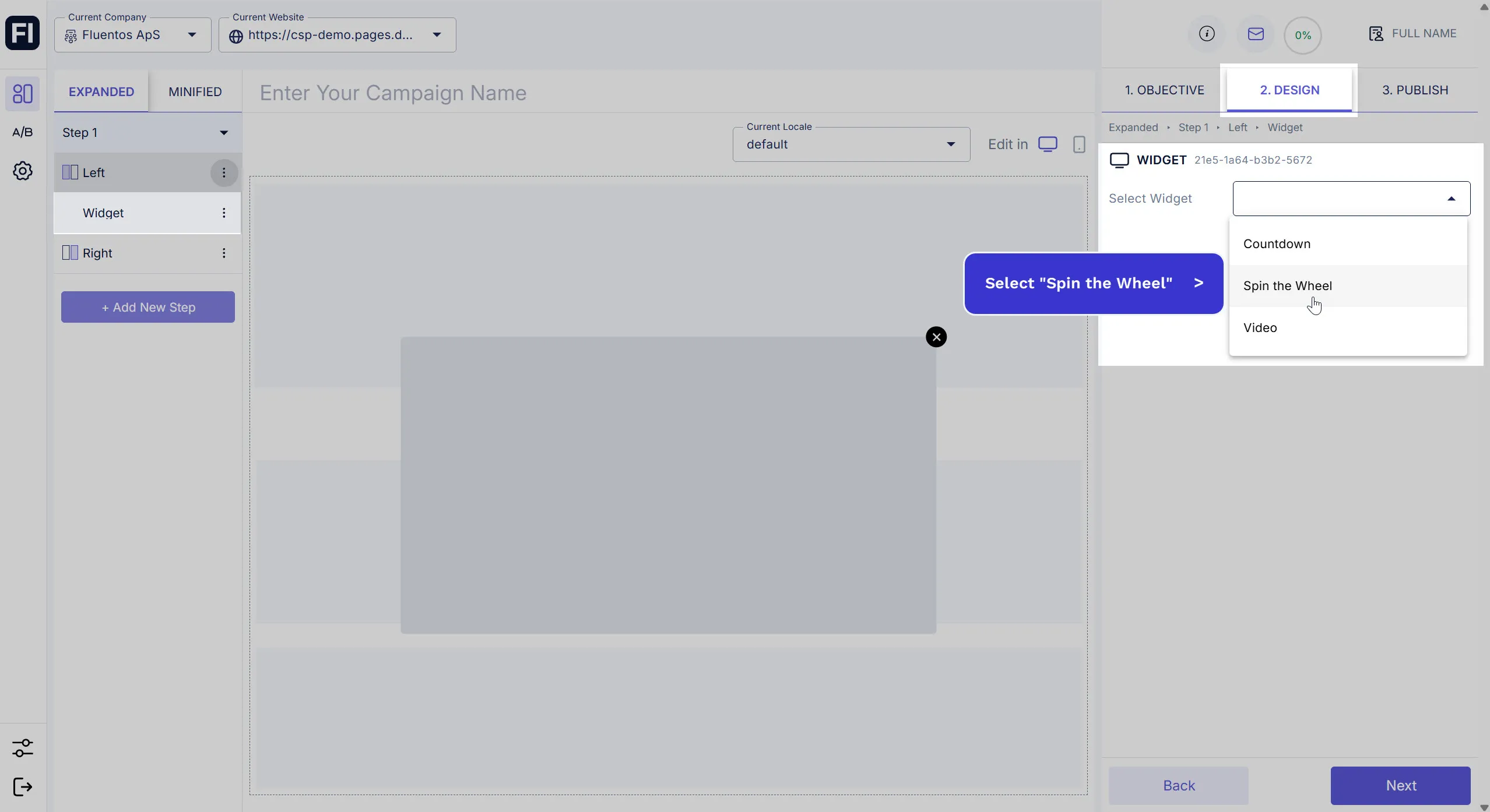
Once the Widget is added to the layout, click on it and select Spin the Wheel from the dropdown that appears on the Design tab in the right panel.
-
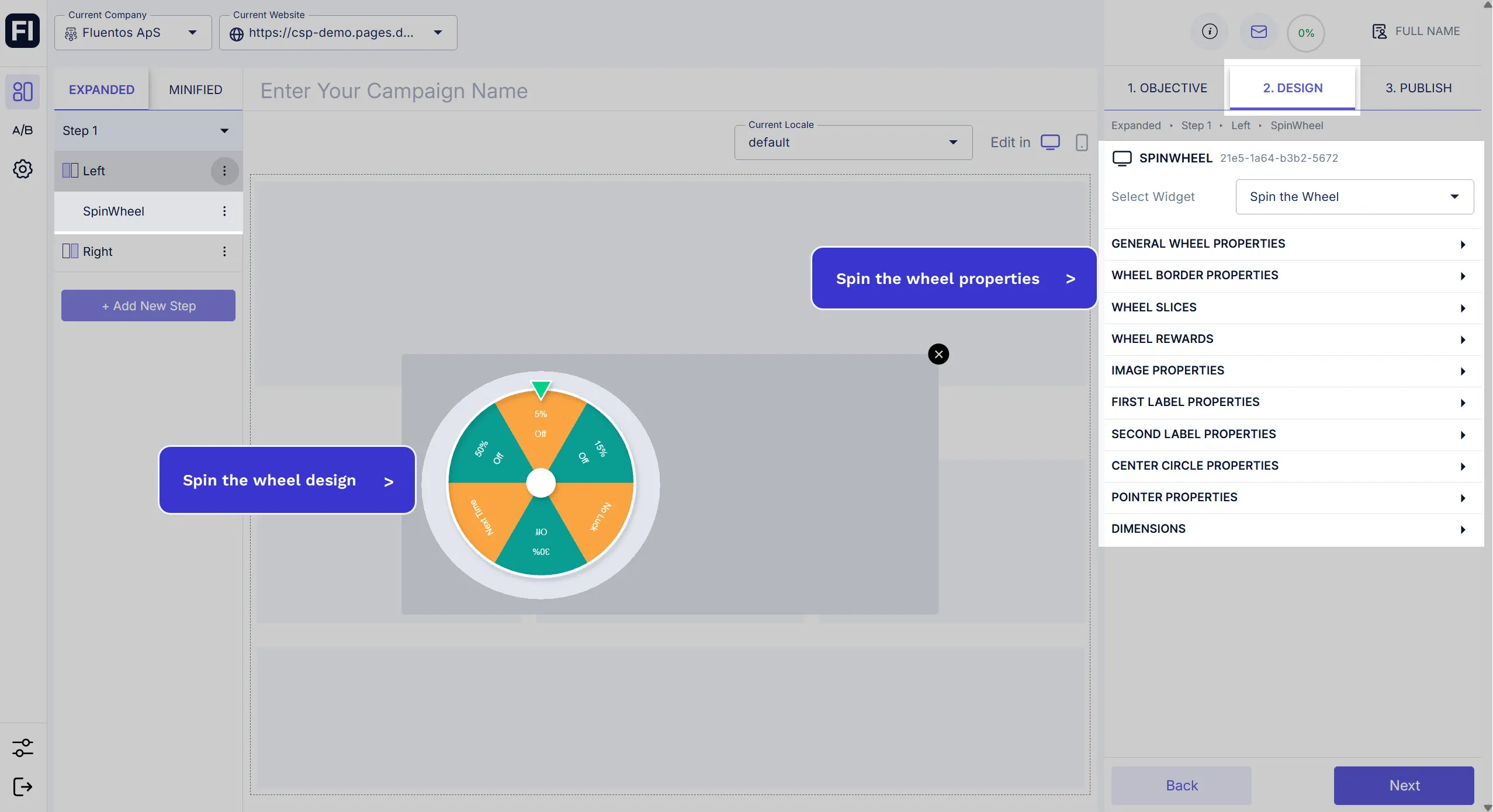
When you select, the wheel is added to the layout container. The Widget is renamed to Spin the Wheel. Its configurable properties become available on the Design tab in the right panel.
Default Wheel Properties
Section titled “Default Wheel Properties”Under General Wheel Properties, the following customizable options are available.
- Name: It’s the name of the design element. By default, it’s set to “SpinWheel”.
- Theme: By default, the Classic Theme is selected. You can change it to the Leaf Theme.
- Spin Duration (Sec): Use the slider to increase/decrease the seconds to configure the spinning duration.
- Number of Spins: This defines the number of spins that should be completed in the selected duration.
- First Slice Color: Select the color of the first slice.
- Second Slice Color: Select the color of the second slice.
- Curved Text: If you check this option, the default rotation is applied to the text.
- Rotate Content: If you leave the Curved Text checkbox unchecked, you can define the text rotation using the slider. Available options are 0, 90, and 180.
Leaf Theme Properties
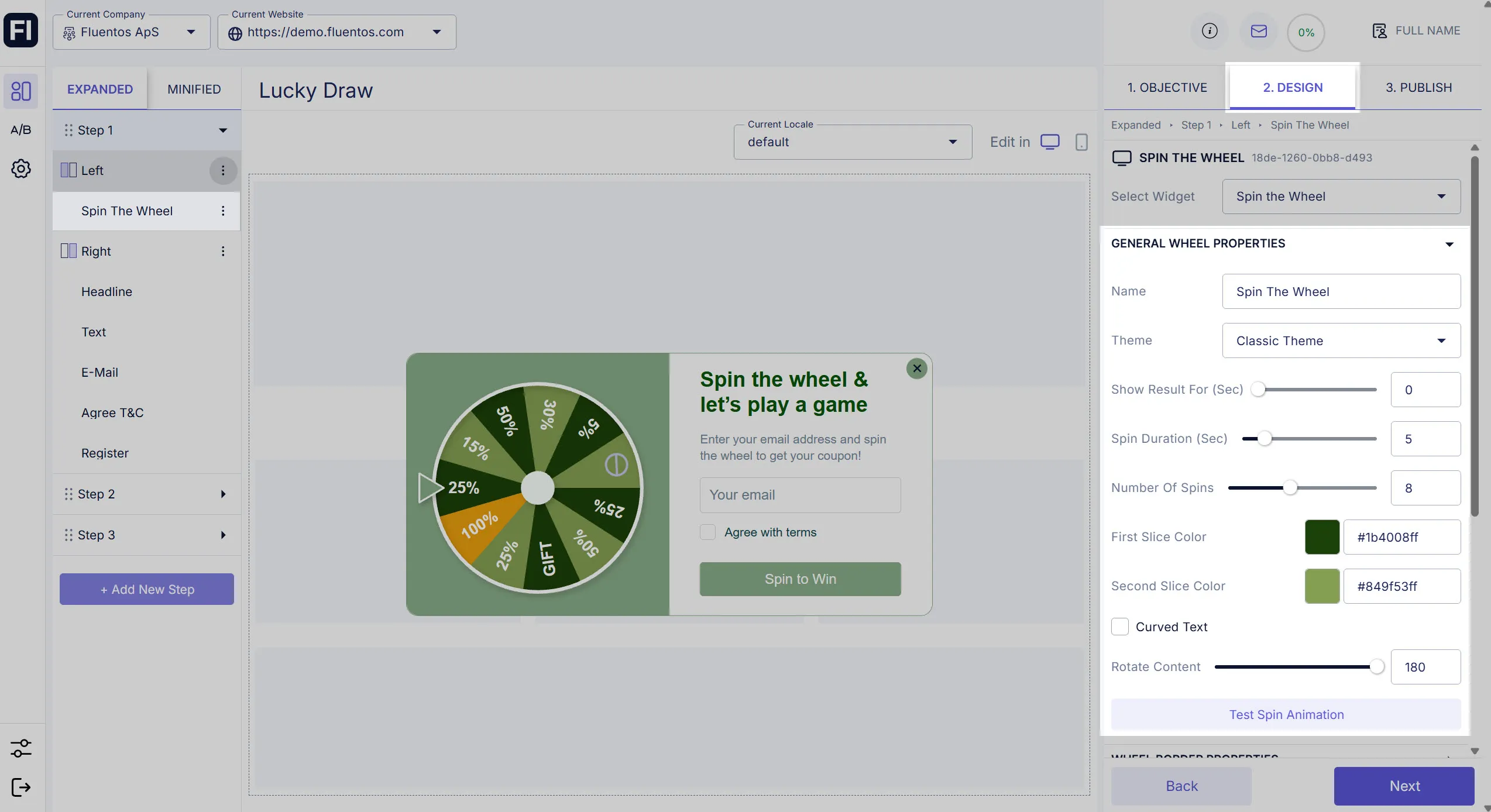
Section titled “Leaf Theme Properties”If you are using the Leaf Theme for your Spin the Wheel widget, additional styling properties are used to configure the Leaf Theme design.
- Width: Using this slider, you can adjust the width of all the leaves.
- Length: Using this slider, you can set up the length of all the leaves.
- Corner Radius: Using this option, you can increase/decrease the radius of the leaves’ corners.
Wheel Border Properties
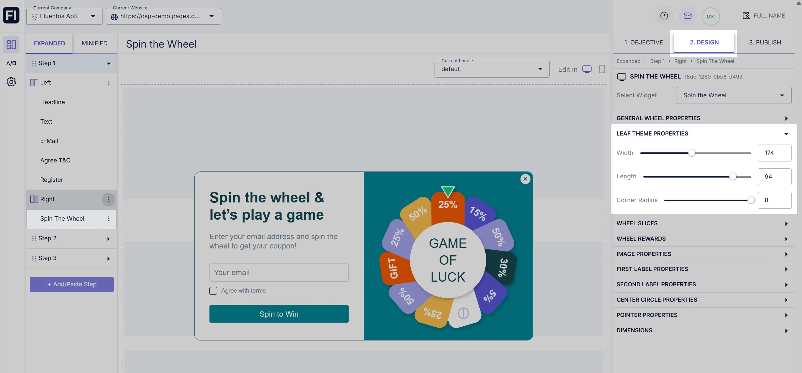
Section titled “Wheel Border Properties”It allows you to define the color and thickness of the border of the wheel.
- Border Width: Use the slider to adjust the border width. If you set it to zero, no border will appear.
- Border Color: Choose the color picker or enter the color hex-code in the field for the border color.
Wheel Slices
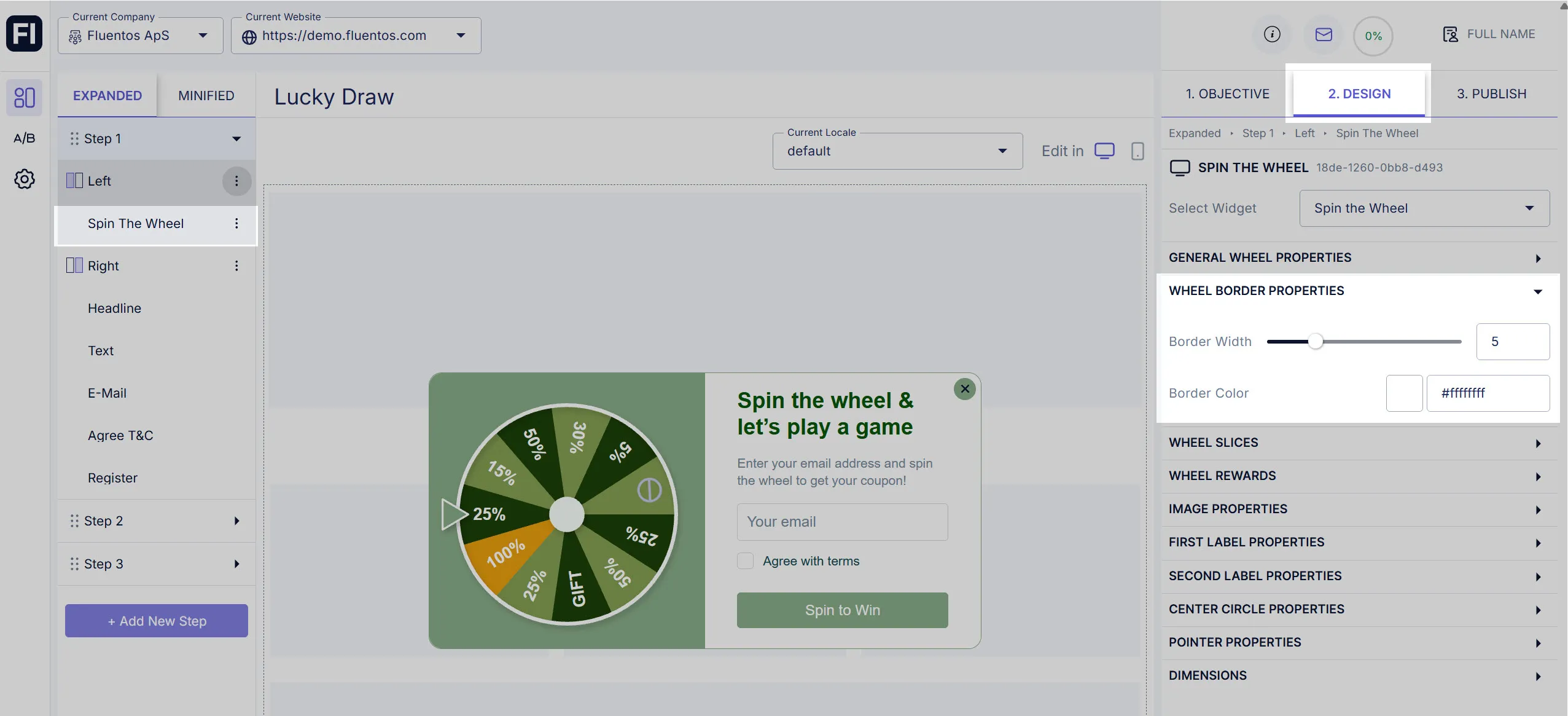
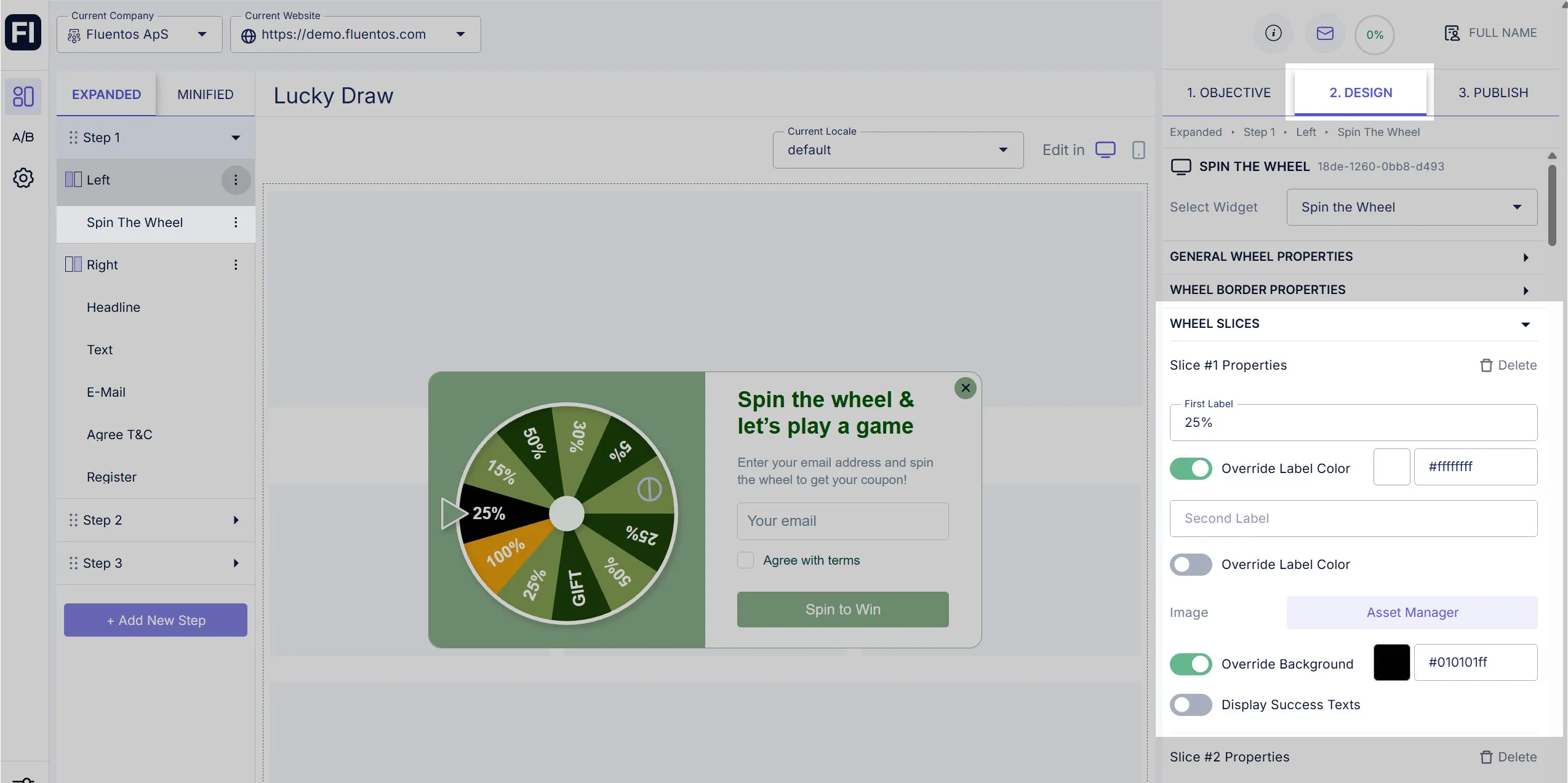
Section titled “Wheel Slices”Under this section, you can style each slice/leaf explicitly. You can also add or delete a slice/leaf.
Styling
Section titled “Styling”The following properties can be customized for each slice/leaf.
-
Labels text: Each slice/leaf can have a primary label (First Label) and a secondary label (Second Label). To define a label, enter the text in the field. If you leave the field blank, the label will not appear. For example, if you want to use only the First Label, enter the label text in this field only and leave the Second Label blank.
-
Label color: Each label of each leaf/slice can be colored differently. To do so, enable the Override Label Color toggle for the label you wish to format. The color picker and hex-code fields will be available to edit the color.
-
Image: You can insert an image in the slice/leaf using the Asset Manager. Each slice/leaf can have its own image.
-
Background: In addition to labels, each slice/leaf can also have a different background color. To do so, enable the Override Background option for the slice you wish to color differently. The color picker and hex-code fields will be available to edit the color.
-
Display Success Texts: For each slice/leaf, you can enter explicit text that will be displayed to the user when the wheel stops at that slice/leaf. To do so, you must first enable the option “Display Success Texts” for that slice/leaf. Then, you can provide the text for the Success Headline and the Success Description fields. When you configure the next step to display the winning slice message and result, these texts will appear. Learn how to use Datahub display.
For example, if the user wins the 25% off, you can enter a message for the user in the headline and description fields.
Add New Slice/Leaf
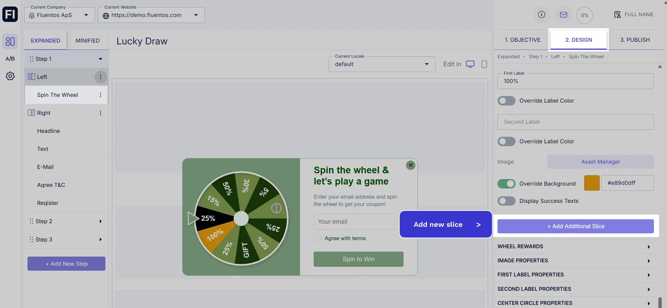
Section titled “Add New Slice/Leaf”To add a new slice/leaf to the wheel, click the Add Additional Slice button given under the Wheel Slices section. A new slice/leaf will be added to the wheel, and you can style it explicitly.
Delete a Slice/Leaf
Section titled “Delete a Slice/Leaf”To delete a specific slice/leaf of the wheel, click the bin icon given against each slice/leaf under the Wheel Slices section.
Wheel Rewards
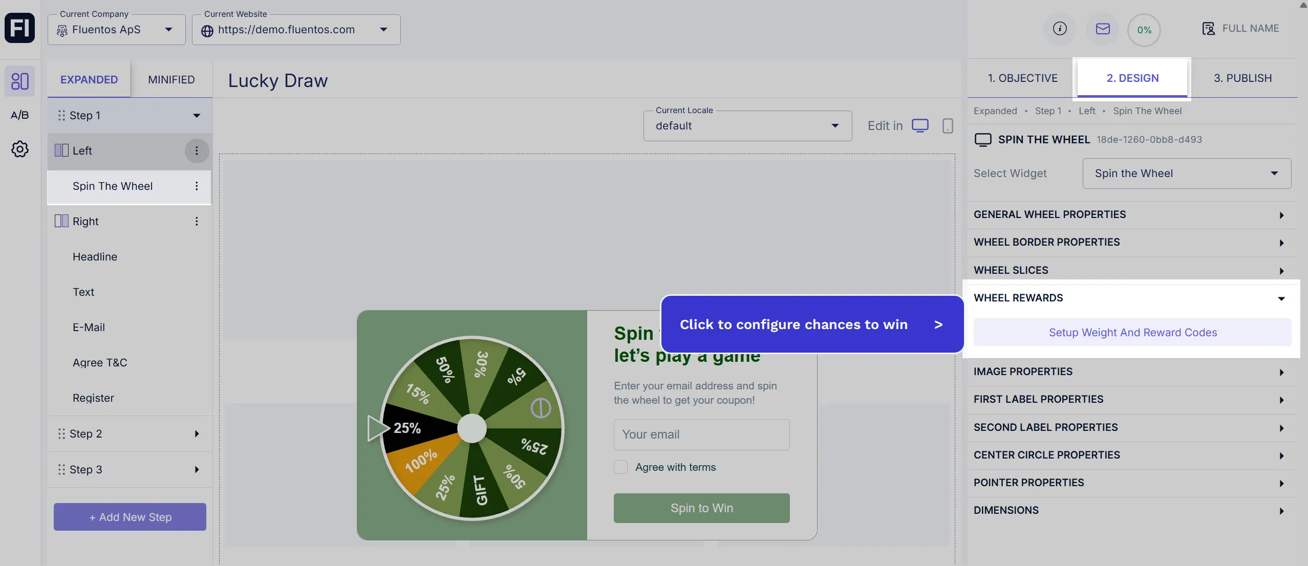
Section titled “Wheel Rewards”Click the Setup Weight and Reward Codes button under this section to configure the chances of winning for each slice and assign an appropriate reward code for the users to provide for claiming the reward.
Upon clicking the button, a popup appears that lists all the slices of your wheel with the following to configure for each slice:
- Reward code: Enter the code that will be displayed to the user when the wheel stops at the specific slice/leaf.
- Chance to win: Use the slider or enter the value from 0-100 to define the slice/leaf weight. The weight of the slice is used to calculate the percentage (%) of its winning.
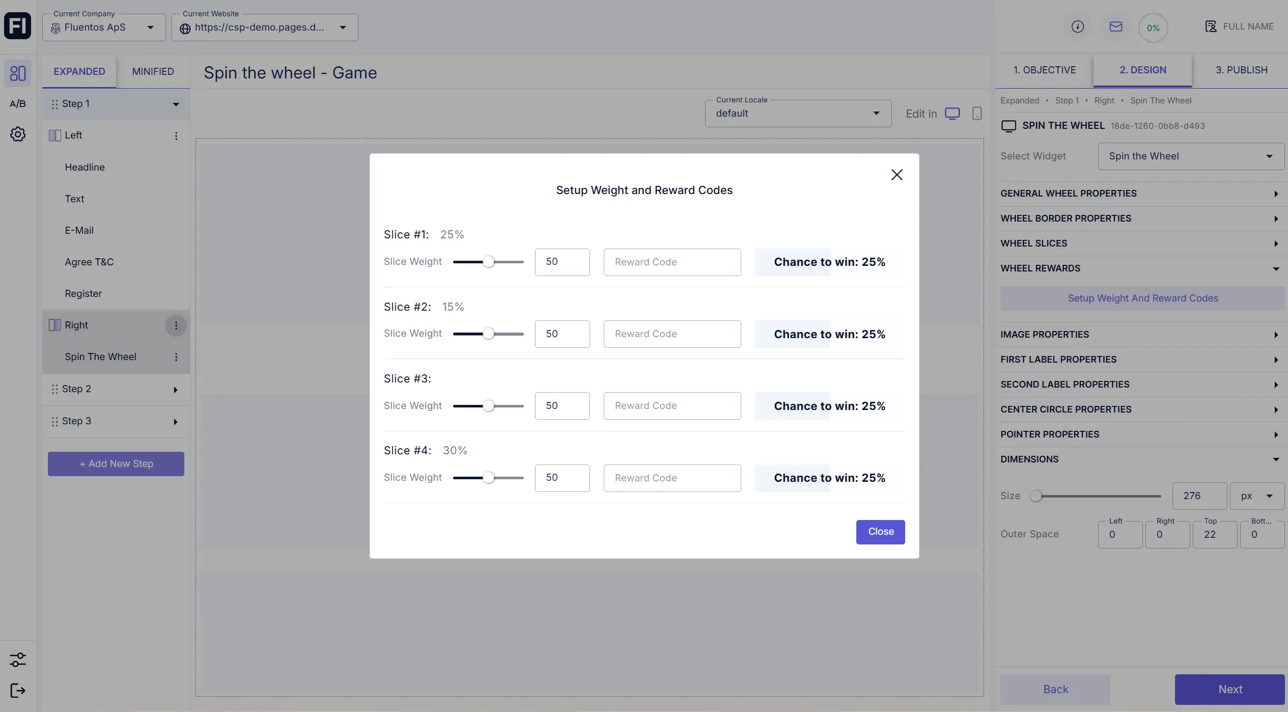
Image Properties
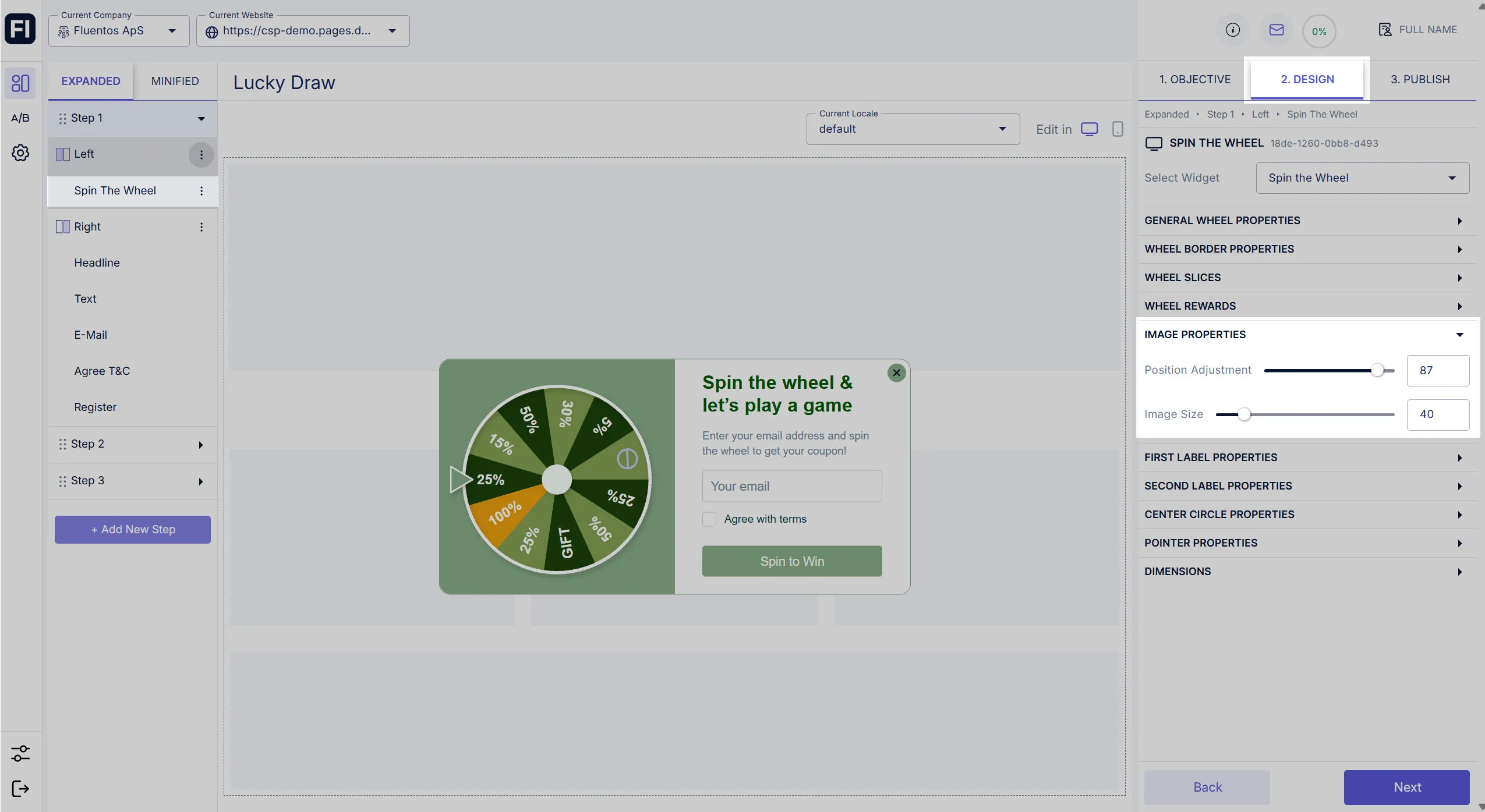
Section titled “Image Properties”Using the options in this section, you can configure the following properties for the images of all the slices in the wheel.
- Position Adjustment: Use the slider to adjust the position of the image within the slice. This is useful, especially when you have added label(s) and an image to the slice. You can control how far or near the center of the wheel you want the image to be placed within a slice.
- Image Size: Use the slider to resize the image so it fits in the slice and the overall layout looks good, according to your design satisfaction parameters.
First Label & Second Label Properties
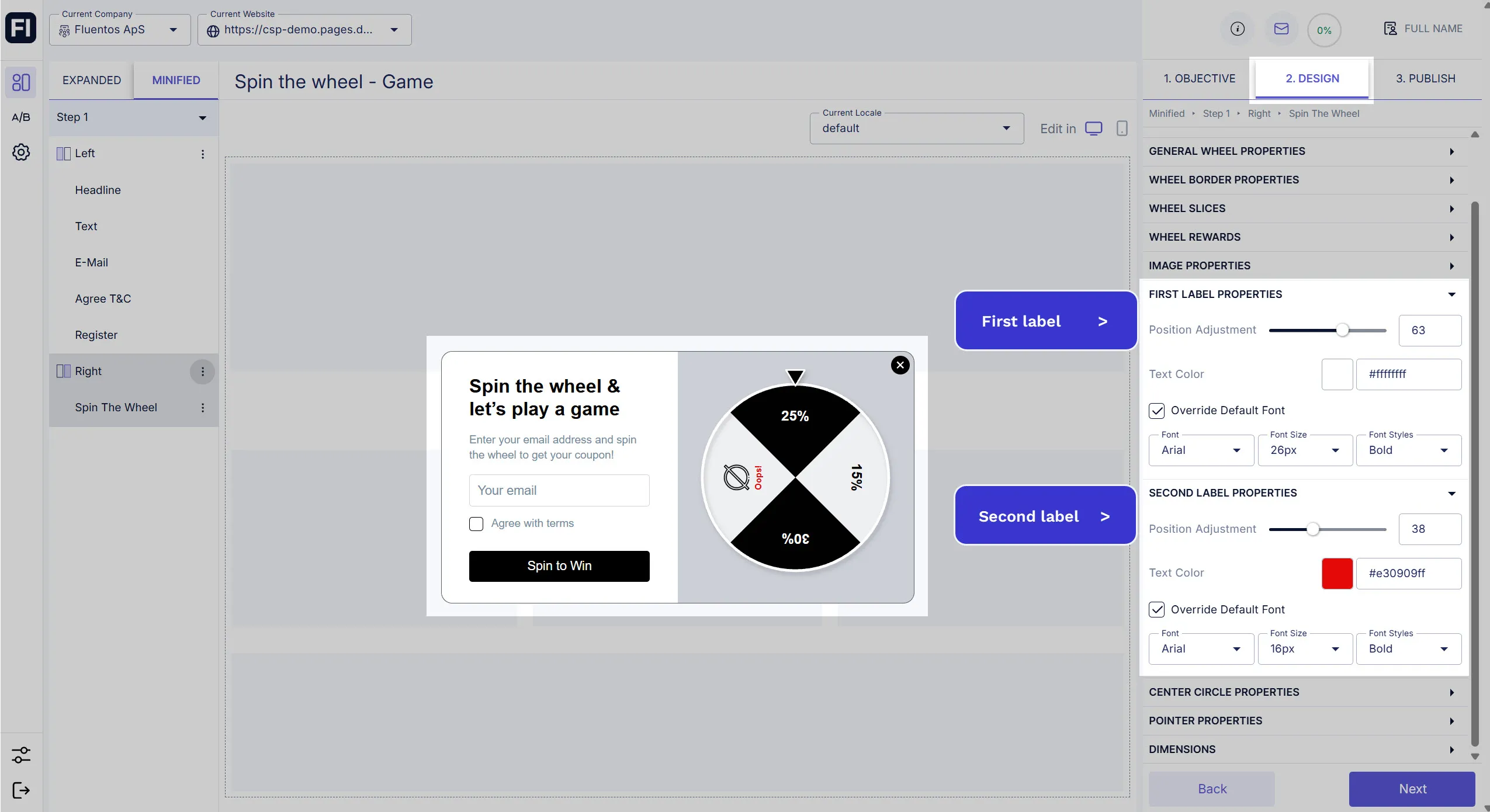
Section titled “First Label & Second Label Properties”To set the overall formatting of each slice’s primary (first) and secondary (second) labels, you can use First Label Properties and Second Label Properties, respectively. The same formatting options are available for both types of labels.
- Position Adjustment: Use the slider to adjust the label position within the slice. Depending on rotation, you can move it near or far from the center.
- Text Color: Define the label color. Whichever color you select here for the first label will be applied to the first labels of all the slices unless you explicitly override the first label color for each slice. The same formatting rule applies to the second label color.
- Override Default Font: If, for the first label, you want to use font formatting other than the default one, check this option and configure it as you wish. The same applies to the override option of the second label properties.
Center Circle Properties
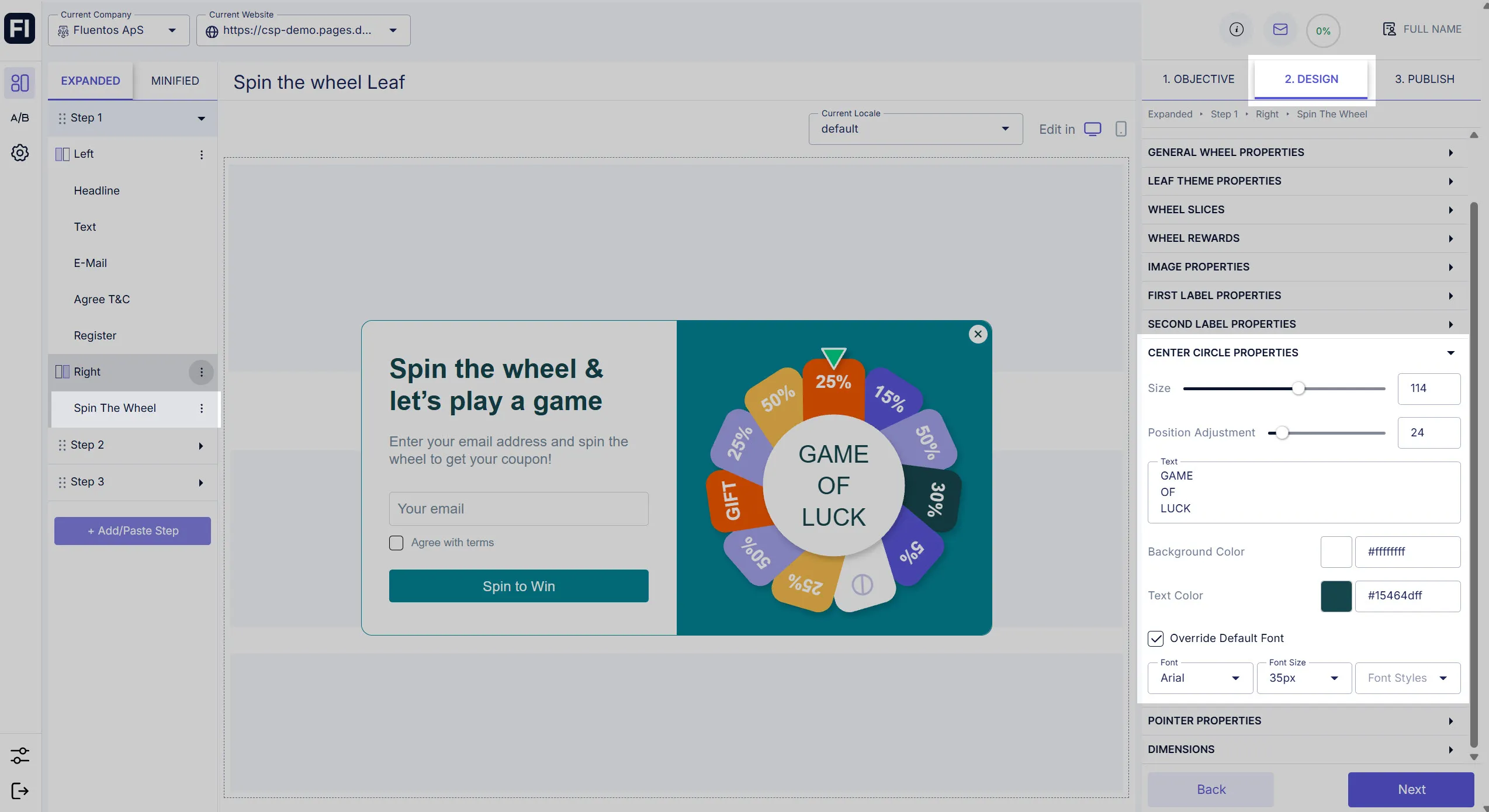
Section titled “Center Circle Properties”You can customize the design of the center of the wheel. The following properties can be configured:
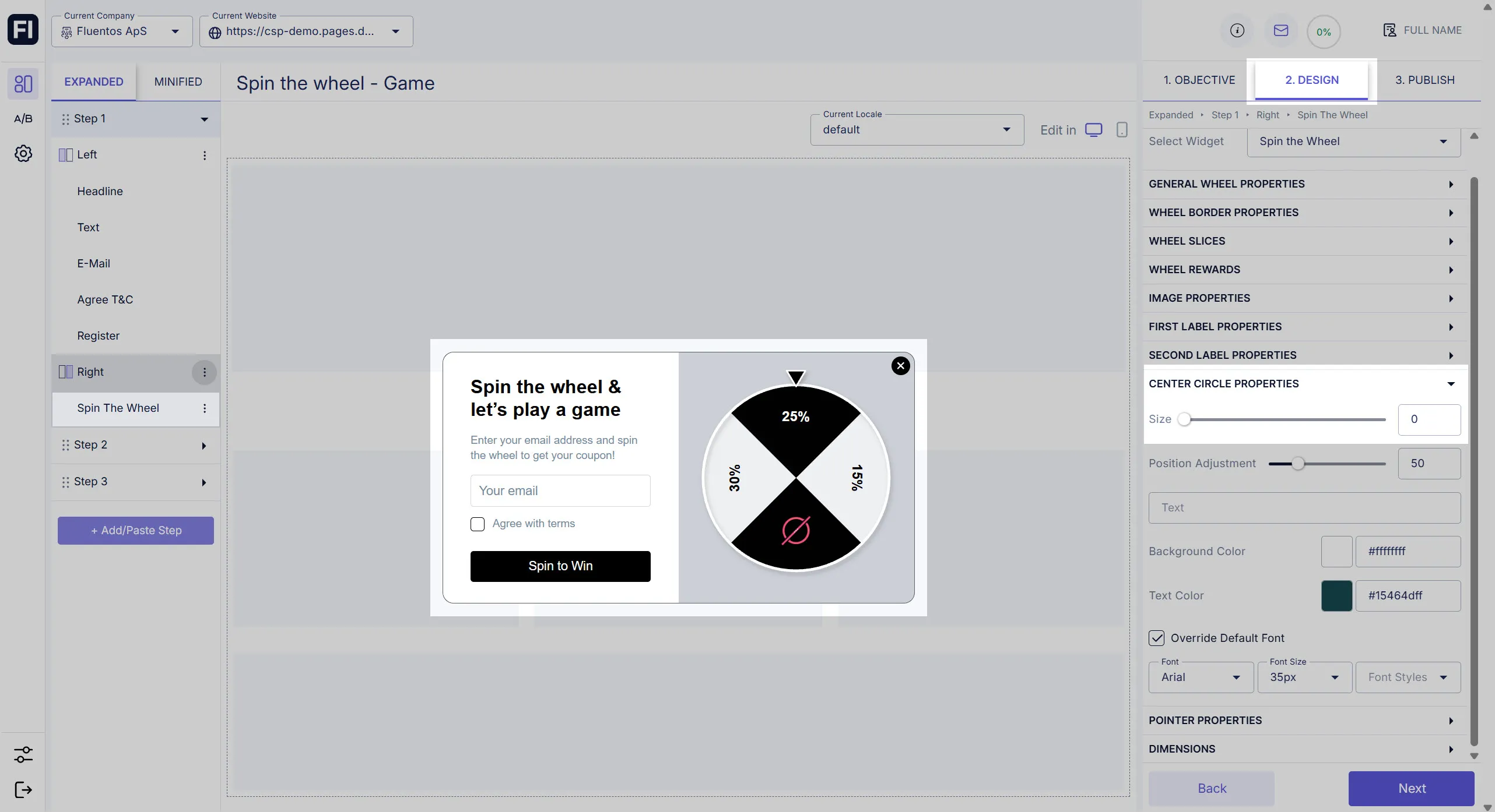
- Size: Use the slider to increase or decrease the radius of the central circle of the wheel. If you set it to zero (0), the central circle will not appear; instead, all the slices will have a merging central point in the wheel.
- Position Adjustment: If you have text in the center, use this slider to move it up or down for appropriate text placement within the central circle.
- Text: A text box is given below the Position Adjustment slider. Here, you can enter the text that you want to appear in the central circle. If the size of the central circle is zero (0), the text will be displayed over the slices.
- Background Color: Define the color of the center using the color picker or hex-code field.
- Text Color: Define the color of the central text.
- Override Default Font: Checkmark this option to explicitly format the central text; otherwise, the text will appear with the default text formatting.
The image shared below is an example of a case where the size of the wheel center is zero (0).
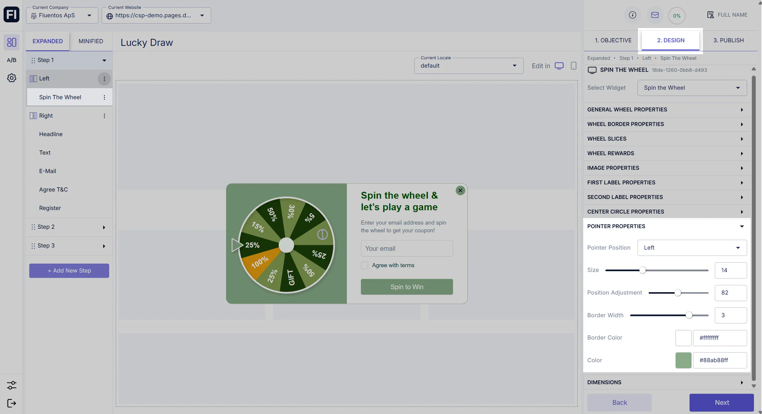
Pointer Properties
Section titled “Pointer Properties”You can style the pointer that is used to point the slice at which the wheel stops.
- Pointer Position: Use the dropdown to set up the default pointer position for the wheel’s dimensions. Available options are Top, Bottom, Left, and Right.
- Size: Use the slider to increase/decrease the pointer size.
- Position Adjustment: This slider allows you to modify the pointer’s position to the slice, for example, how far or near it is to the leaf.
- Border Width: Use the slider to define the border thickness. Values from 0 to 4 can be selected.
- Border Color: You can also define a specific color for the pointer border.
- Color: It allows you to define a color for the pointer.
Dimensions
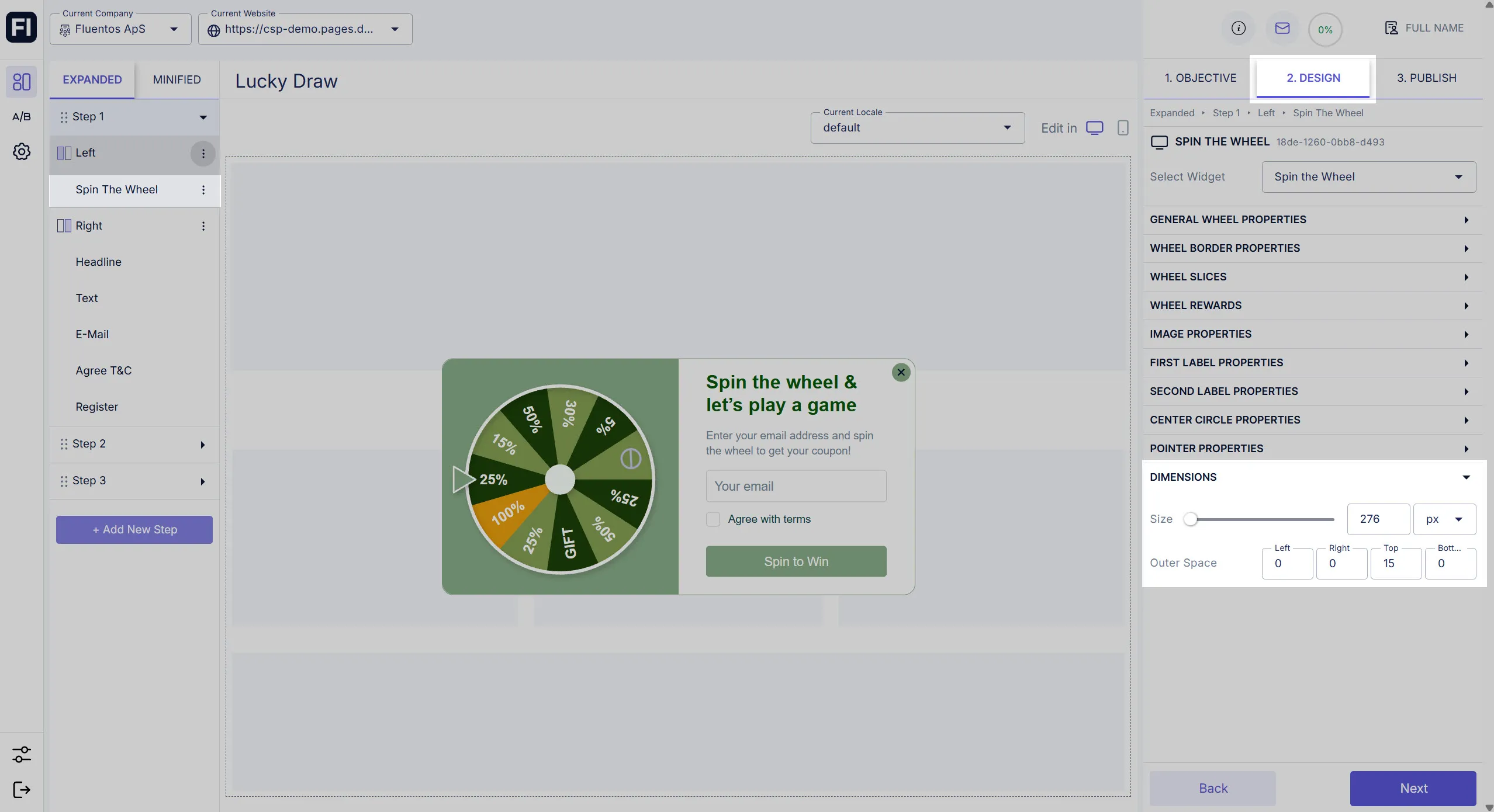
Section titled “Dimensions”Use these settings to adjust the size and positioning of the wheel to its container.
- Size: Move the slider to the right or left to increase or decrease the wheel size.
- Outer Space: Use the four-dimension counters to adjust the placement of the wheel to its layout section by changing its outer distance from the four sides.
Live Data
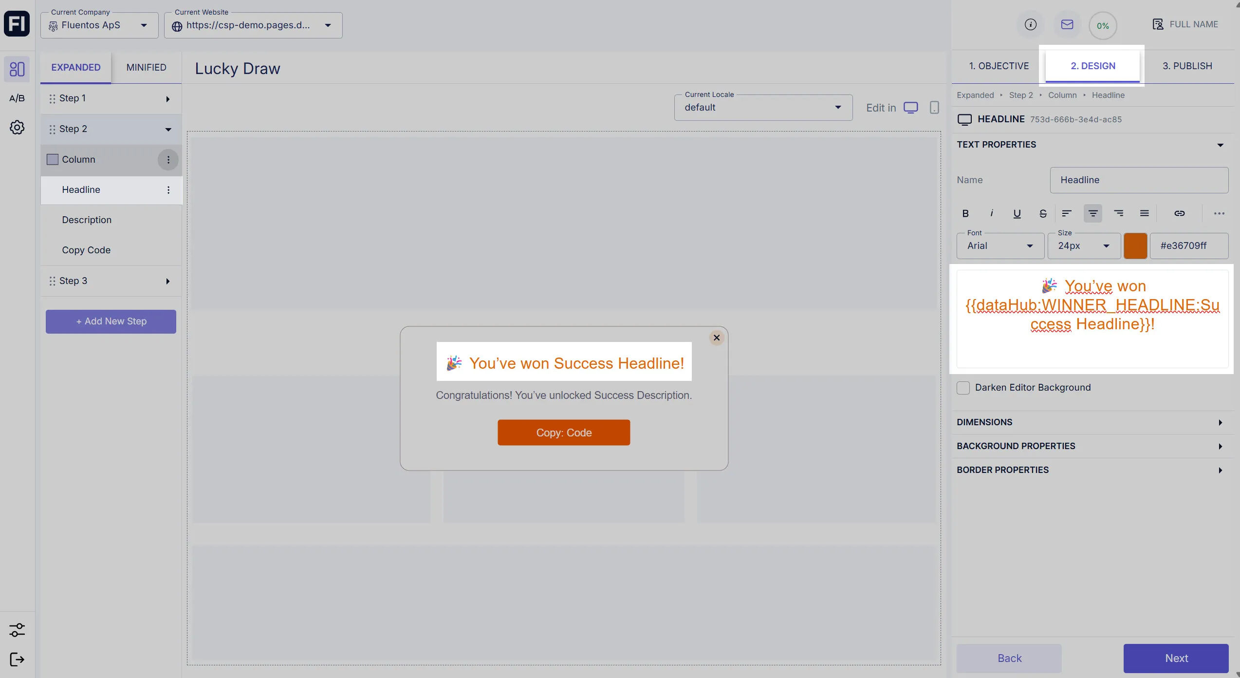
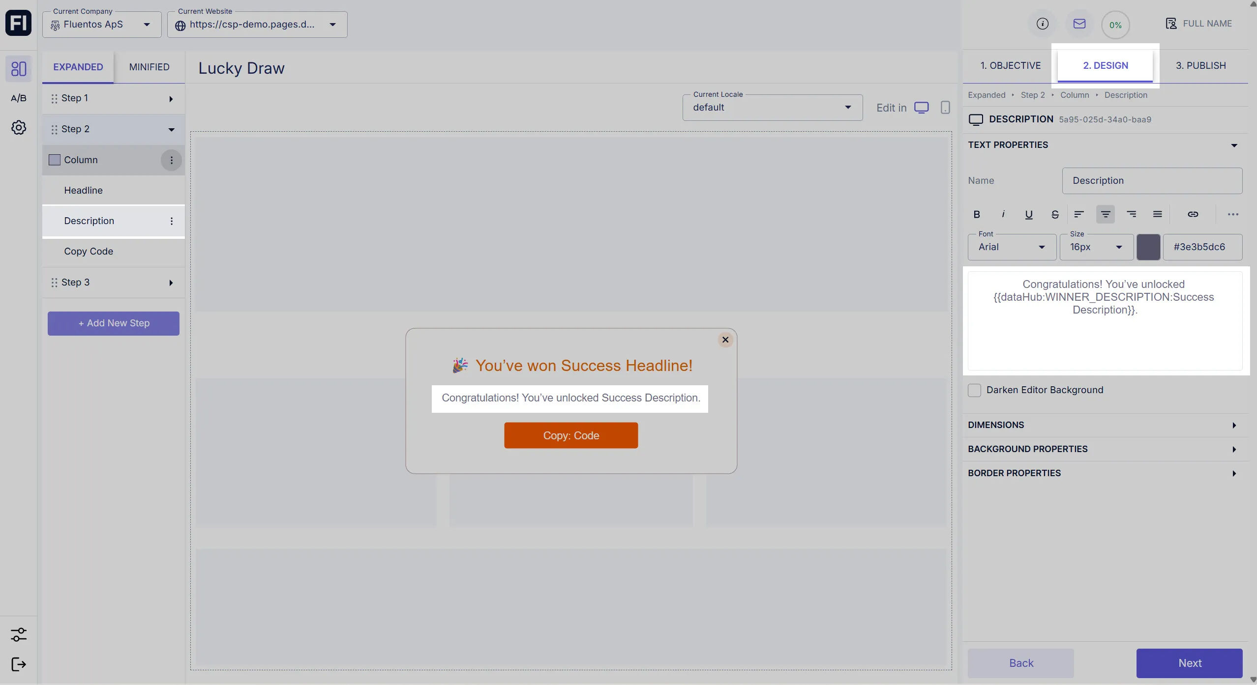
Section titled “Live Data”Every slice has three elements that can be used with the Datahub display and further Step display.
In the image shared below, the dataHub code displays the headline of the winning slice in Step 2.
In the image shared below, the dataHub code displays the description of the winning slice in Step 2.
In the image shared below, the dataHub code displays the winning slice code in Step 2.
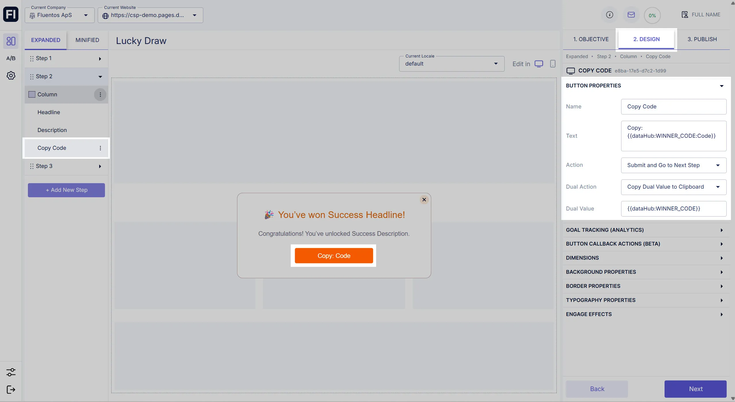
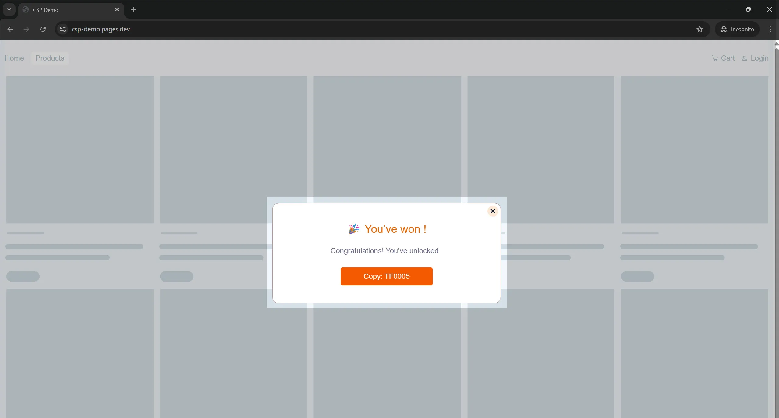
Example: Referring to the image below, if the wheel stops spinning at the slice configured for a 25% discount, its success headline and description will be displayed along with the code configured for it.
WINNER_HEADLINE
Section titled “WINNER_HEADLINE”{{datahub:WINNER_HEADLINE:You won 20%}}WINNER_DESCRIPTION
Section titled “WINNER_DESCRIPTION”{{datahub:WINNER_DESCRIPTION:Use this code in the checkout}}WINNER_CODE
Section titled “WINNER_CODE”Inside the step display:
{{datahub:WINNER_CODE:FREE TSHIRT}}Inside the integration:
{{datahub:WINNER_CODE}}Localizable Properties
Section titled “Localizable Properties”You can localize the following properties of the Spin the Wheel widget when you are designing your campaign in different locales. You will see the Localize toggle option against the following properties, enabling you to customize them in each locale.
- Leaf Theme Properties: Width and length can be localized.
- Wheel Slices: First and Second labels of each slice/leaf can be localized.
- Image Properties: Position Adjustment and Image Size can be localized.
- First Label Properties: Position Adjustment can be localized.
- Second Label Properties: Position Adjustment can be localized.
- Center Circle Properties: Size, Position Adjustment, and text can be localized.